


Why website accessibility?
When the Americans with Disabilities Act (ADA) went into law in 1990, it focused primarily on making brick and mortar storefronts more accessible to individuals with disabilities.
In 1998, the law’s scope expanded to include electronic and information technology, including websites.
This means federal agencies, federally funded nonprofits, public schools K-12, and public colleges and universities must make their websites accessible to people with disabilities. Many organizations beyond the public sector voluntarily comply with the law to broaden their web audience.
The most recent standards for website accessibility, the Web Content Accessibility Guidelines, are updated regularly. (You can learn more about WCAG here.)
Who is the audience?
“Users with disabilities” covers a broad spectrum of people.
Approximately 61 million adults in the U.S. live with a disability. That’s about 26% of total adult Americans. More than half of these people access the internet regularly.
Those with chronic mobility, hearing, or visual disabilities come to mind first, but the user base also includes those with learning disabilities, such as dyslexia, and people with temporary issues, such as a broken hand.
People without disabilities also benefit from accessible websites. Such sites often improve user experience and thus build brand loyalty and encourage conversions.
Making Your Website Accessible
Consider Assistive Technologies
Individuals with a disability often use assistive technologies to fully access the internet. These technologies include mouse alternatives, screen readers and unique browser preferences.
Mouse Alternatives
If a user cannot operate a mouse, due to, say, Parkinson’s or a broken arm, that user might be limited to the keyboard and rely heavily on shortcuts to navigate content on a page or between pages, access and select links, and fill out forms.
Screen Readers
Screen readers help visitors with a visual impairment or learning disability. Screen readers such as Jaws select text on the screen and read it aloud to the user. This technology also helps those with cognitive disabilities understand text verbally if they cannot grasp it in written form.
Browser’s User Preferences
Today’s browsers include several options to help with accessibility. Users can set font size and color, background colors, zoom level and more to mitigate visual impairment. On some browsers, text-to-speech technology helps with hearing and cognitive disabilities. Make sure your site “plays well” with these types of preferences; test for them throughout the design and development process.
Website Creation
To make your website accessible to everyone, bake accessibility into design, content, and development.
Design
This includes text and background color considerations and animation and motion.
Contrast Between Text and Background Colors
Your site’s background color should not conflict with your text color. If the colors clash too much, it can negatively impact individuals with visual impairments.
Very dark grey text on white background is the easiest to read. (Some find pure black on white too high in contrast.)
When we developed the SKYGEN USA website, we put grey text on a white background. Testing showed this level of contrast increased readability.

On the other hand, medium blue text on a slightly lighter background has poor contrast.

Color Shouldn’t Cue Important Elements
Never rely on color alone to flag key information, such as top navigation or a selected checkbox. Accommodate those with color blindness and those who use a keyboard to navigate.
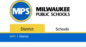
On the Milwaukee Public School website, both color and a shape indicate the current page in the top navigation.
Compare that with the following top navigation, in which neither shape nor color indicate the selected page. This arrangement would confuse any visitor.

Motion and Animations
Motion and animations are trendy, but they shouldn’t dominate your design. Motion should be slow and smooth rather than flashing or flickering. The user should have an easy way to pause or advance animations.
For example, on the Employ Milwaukee website, buttons control the homepage slider. Site visitors can change the photos when they’re ready and they can pause the slide show.
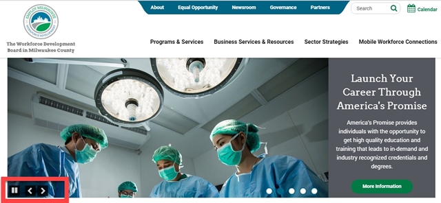
This feature, designed for visitors with visual impairments, gives everyone an opportunity to read the slider before moving onto the next panel. Slider text often gets lost when the slider moves automatically and quickly.
Content Creation
A website would be literally nothing without its content, but we often overlook accessibility when we’re busy creating content.
Use Headings Correctly
Your website should have six levels of distinct heading styles, often with specific font sizes and even specific colors. These provide structure. (Use levels that fit the content; no need to use them all on every page.)
Headings should be short, descriptive and easy to understand. They break up the page and highlight important topics and sub topics.
The highest level, Heading 1, should only be used for a page title. This is important for both accessibility and SEO.
For Heartland Advisors, we chose font sizes and colors to show how text is structured. The largest heading is a heading level 1 (“heartland select value fund”), while heading level 2 (“overview”) is slightly smaller. Heading level 3 (“investment focus”) is even smaller and rust colored.

These visual cues are great for users without visual impairments. Those who can't see the visual clues can rely on a screen reader to help them understand heading level and page organization. They also help screen readers make sense of the page.
Images and ALT Text
Alt text (or alternative text) is a word or descriptive phrase that can be inserted as an invisible html attribute to describe an image. The screen reader recites this text to a visually impaired user. Most content management systems allow you to easily insert alt text when you upload an image. Alt text can also be “hard coded” with HTML.
Alt text can help users with visual impairments understand the image. Without alt text, a screen reader can’t adequately interpret an image.
Whenever possible, add visually descriptive captions to a photo. This helps everyone, even visitors without visual impairments, to understand a picture.

Half-moon at 5:30 in the morning. May 25, 2016.
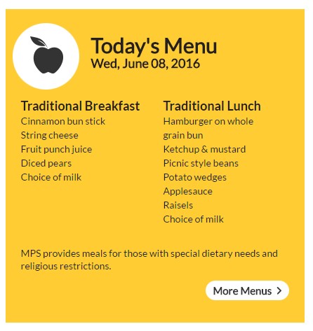
You need not add alt text to all your images. If you are simply using an image for a decorative purpose, such as the apple icon on the Milwaukee Public Schools lunch menu, alt text of “decorative apple” adds no value for the user. It would be screen-reader clutter.
Alt text and SEO
Alt text positively impacts your SEO health. Google and other search engines read and interpret alt text and use it when they index your content and images. Adding alt texts that support the overall message and keyword phrasing on a site are likely to improve the odds for a higher page ranking for your target term(s). Alt texts also raise the likelihood of your image showing up as a Google image search result.
Google has indicated that alt text should describe your image, but describe it succinctly. They didn’t give a “magic number,” but aim for 10-15 words.
Captions and Transcripts
Audio and video add a lot to a website. However, it can be difficult, if not impossible, for those with hearing impairments to adequately engage with video.
Heartland Advisors understood this and added transcripts and summaries to their videos.

If you promote and host your videos on YouTube, you can use its auto transcript service, available if your video is in English, Dutch, French, German, Italian, Japanese, Korean, Portuguese, Russian or Spanish.
YouTube’s captions are auto-generated by artificial intelligence, so quality may vary. You can update the results for accuracy. (Learn more about YouTube’s caption feature here.)
If you don’t want to use YouTube’s auto translate feature, you can upload a transcript or create your own transcript file.
Use HTML Tables Only for Tabular Data
Use HTML table elements to convey data – and use them for nothing else, including page layouts. Misusing them for layout and design makes keyboard navigation difficult and can confuse screen readers.
But tables convey tabular data very well, as in the case of this product variation table on Server Products. The table makes the data easy to scan and expedites buying decisions, helping all users. It is also accessible.

Development
Accessibility considerations don’t stop once the website is designed. Many aspects of accessibility play into development (i.e., coding).
Skip Links
Skip links are among the most important features for those who don't use a mouse.
Such visitors typically move from link to link by hitting the tab key. Because the tab starts at the top left, people must tab through the utility nav, search bar, top nav, and other top links before reaching the primary content on the page. This is the case on every page.
A skip link added at the top of the page can whisk users straight to content, which saves time and adds convenience.
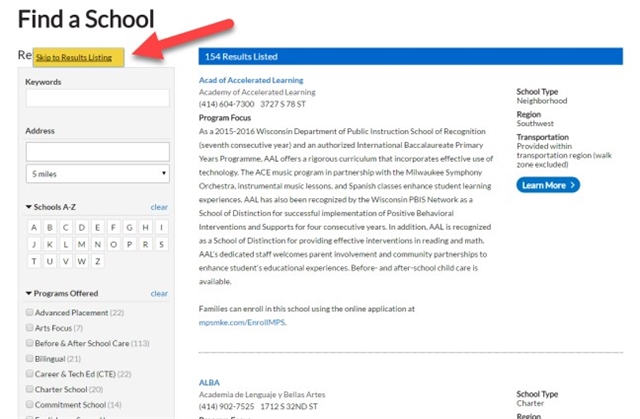
For Milwaukee Public Schools, we added skip links to go straight to search and to main content. This shows up only if someone hits the tab key on the keyboard, so the skip links do not distract others.
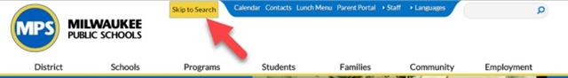
MPS has many filters. We added the skip links convenience so visitors can skip the facets and go straight to the results, and vice-versa.
Coding For Keyboard Shortcuts
Skip links are one way to navigate without a mouse. Certain keyboard strokes, including tab, enter, and space bar – can allow users to move from link to link, select a link, and open/close hidden content.
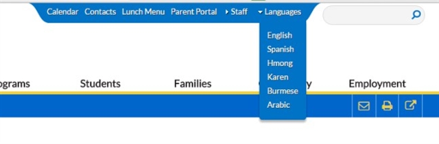
MPS’ language switcher is a good example of opening hidden content. The drop-down for languages opens when someone tabs to the languages link and hits enter on the keyboard. Pressing enter when languages is selected and open also closes the drop-down.
Testing For Accessibility
Before your site goes live, test for overall website accessibility and for level of accessibility: AAA (the highest), AA and A (the lowest). Several in-browser and third-party applications can test the accessibility of your visual design and content structure. Among them:
- The WebAIM tool is good to check text-to-background color contrast before design begins
- Use browser extensions to check accessibility on an existing site. Some browser extensions for Google Chrome are Accessibility Developer Tools and WebAIM’s extension Wave Evaluation Tool.
Each extension gives a good idea of certain WCAG criteria, but they can return false negatives. For example, they often report errors for a lack of alt text on a purely decorative image that doesn’t require it.
Since many aspects of accessibility focus on user interactions, live user testing is especially important. Test items include:
Complex interactions: How hard is it to use a drop-down menu? Is it easy to use the keyboard strokes to navigate? Are movements on the page impeding someone from completing a task?
Complex navigation: How hard is it to navigate among pages? Is the navigation structure hard to understand? Is text well organized?
Terms and words used: Does vocabulary lie within an expected reading level? Does the audience understand it?
Summary
Nearly everything listed in the Section 508 guidelines applies to websites, even if accessibility is not a priority. The guidelines are good for general usability for everyone and for search engines. Increasing accessibility will make your site more useful to a wider audience even as it brings you closer to Section 508 compliance.