


Builders of apps face many design decisions related to how a user will interact with the app.
Which icons will convey clear meanings? When users tap on the icons, will the app behave in ways that users expect? Is the navigational structure clear and easy to understand, or does the user get lost three screens deep?
The answers to these questions can mean the difference between a user raving about your app (5-stars!) and uninstalling it within minutes.
The layout impacts all of these design decisions and thus the usability of the app. And the designer’s hands are not entirely free; device manufacturers, such as Apple and Google, have pretty strong opinions about layouts.
But before we dive into opinions – theirs and ours -- let’s define terms.
Layout
Layout, as the term relates to mobile apps, refers to the visual structure your app displays to the user on any given screen.
Sound simple? It’s not, really. Think of layout in terms of automotive user interface. It would cover everything from placement of cup holders to size of the windows to the size of the wheel wells, to name just a few of the hundreds of design issues involved in the layout of a car.
The same with mobile apps. As with automobiles, industry standards and practices apply to apps. They help, but you’re bound to want your app to do things that don’t adhere to the norms of layout design.
Note that we’re dealing with “visual structure,” which is not the same thing as the “look” – the colors, icons, themes, etc. -- of the app. The layout (or visual structure) addresses such questions as: How does the menu get displayed when expanded or contracted? Are buttons/labels aligned to the tops or sides of fields? Are items displayed as lists or grids?
Orientation
For any given layout, we can safely assume one of two orientations: Landscape and Portrait.
Most devices support both, so app developers have become accustomed to keeping both orientations in mind during the building process. But note that when orientation changes, so does content. What looks and works great in one orientation might require complete reworking in the other one. In some cases, developers choose to support only one orientation, because it wouldn’t be feasible to attempt to support both.
Sometimes, supporting only one orientation is a simple matter of reducing work load. For example: You double the work of user interface testers by supporting both landscape and portrait, in addition to the extra work demanded from developers in the first place.
Dual orientation also affects aspect ratios of background images and text. This seems like a minor detail, but if you plan on having images and icons in your app, you must account for them, and this also adds to the workload of the front-end team designing the app.

Screen Size vs. Density vs. Resolution
When developers and civilians discuss layout, the terms screen size, density and resolution can lead to confusion. Let’s clear it up.
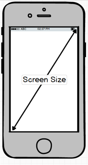
Screen size refers to the physical dimensions of the screen on the device, typically measured along the diagonal backlit screen, in the way we customarily measure television screens. Screen sizes vary greatly from one device to the next. Even in Apple’s homogeneous ecosystem includes a significant number of screen sizes. Even if we assume that all the densities are the same (hint: they aren’t), you must take into account each separate screen size when considering layout options. Some layouts work brilliantly on tablets, which range from eight to 14 inches, but are too busy or tightly packed onto a 3.5-inch phone screen.
Density refers to the number of pixels within a specified portion of the screen. The usual terms for this are DPI, or dots per inch, and PPI, or pixels per inch.
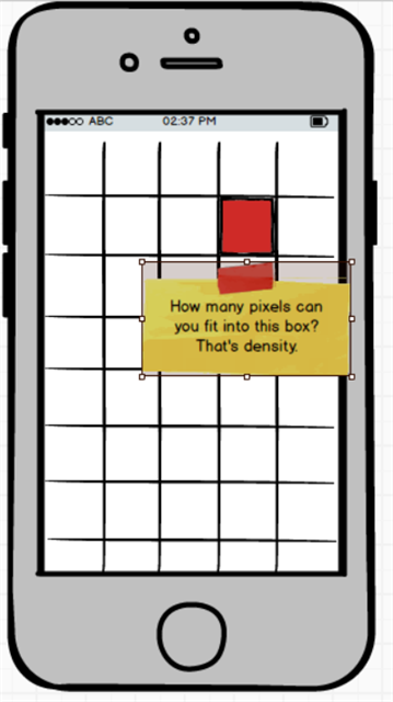
Density impacts layout. It can limit the options for the sizes of text, icons, images and animations. To support phones with very low density, you may need to use fewer words in your text and labels in order to keep the layout from being shifted around unexpectedly. Likewise with icons and images. You may need several sets of them to match the densities of various devices. Discuss this with your designers when building out the mobile app.
Resolution: Multiply DPI by screen size to get the resolution, often expressed as height and width relation -- 1024x768 or 1920x1200, to name two common ones -- rather than as a raw number. Generally speaking, though, app developers do not design for specific resolutions, but rather for groups of resolutions.
Density-Independent Pixels
Support of every possible combination of screen size, density and resolution would require millions of combinations of text, icon, and image sizes. Fortunately, mobile platform developers have provided designers with density-independent pixels (dp in Android-speak, and point, or pt, in iOS).
The beauty of these systems is that they allow you to define the size of an item in your layout based on abstract concepts. For example, specify that “I want that image to be 10dp x 10dp (or 10pt x 10pt),” and then let the operating system scale the actual physical image up or down depending on the resolution of the device. This removes a lot of work from developers and designers and leverages the power of the device itself to properly size images on any given screen.
This all leads to our last point related to screen density and resolution: The way the different platform builders group these concepts.
Android breaks down the millions of combinations into six categories:
- ldpi (low) ~120dpi
- mdpi (medium) ~160dpi
- hdpi (high) ~240dpi
- xhdpi (extra-high) ~320dpi
- xxhdpi (extra-extra-high) ~480 dpi
- xxxhdpr (extra-extra-extra-high) ~640dpi
Similarly, Apple has grouped these combinations into what I call scaling factors, commonly referred to as the number of PTs at 1x, 2x, or 3x.
Why does this matter?
Are you thinking something like “Can’t I just create a layout for a screen and expect the developers or the platform to handle the scaling for me?”
We have a nuanced answer to that sensible question, coming soon in Part 2 of this Northwoods Blog post. Stay tuned.