Skip to Content
Main Content

Hiker Looking Out Over Mountains

6 Minute Read | March 21, 2022

Top 5 Email Design Mistakes

Updated: March 21, 2022
Originally Published: April 5, 2019


Email design plays a great role in your recipients’ absorption of your message and willingness to click on your call to action. However, common email marketing mistakes can inhibit your users from taking action after receiving your email. Avoid the following email design mistakes when crafting your next campaign.

Too Many Images

The most common email marketing mistake is excessive images. While email images do increase click through rates, relying solely on images creates its own set of problems.

Not all inboxes automatically download images. In fact, only Gmail sets up new accounts to download images automatically. With all other providers, images download from select senders only, the recipient must turn on downloading as a setting, or images are never downloaded automatically.

This becomes a problem when your key messaging is built into the images within your email. It’s one thing for your recipients to miss out on a design element contained in an image, it’s another thing entirely for your recipients to be unsure of the purpose of your email because the images are not automatically downloaded. Blocked images in this case mean lost messages and calls to action.

An email that's an example of how the text is impossible to understand without images downloaded

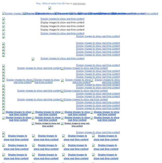
This email is impossible to understand when images aren’t loaded. All content and messaging is built into the images, which is lost when they don't load properly.

If your email design focuses on text, with images as a complement to the copy, this isn't a problem. The copy carries the main message, so missing images don't impede your calls to action.

An email that shows how the main calls to action are understandable even without the images downloaded

Even without displaying images, the main calls-to-action in this email template are easily conveyed and comprehended.

Unclear Calls to Action

A strong call to action is one of the best ways to raise click-through rates in your emails. But recipients will miss or ignore calls to action that are hard to spot.  Too often, calls to action are not prominent enough to gain attention or too many of them compete for attention and confuse the recipient.

Hidden Calls to Action

Readers tend to skim emails. Calls to action should be prominent to recipients in skimming mode. If calls to action are too subtle, users will miss them.

Too Many Calls to Action

An overabundance of calls to action can leave readers wondering what you want them to do. It's better to focus on crafting one, strong and prominent call to action per email. If you ask your contacts to do too much, they'll do nothing.

Non-Responsive Templates

A majority of email has been read on mobile since mid-2017, and more and more users have shifted to reading email exclusively on mobile since then. If your emails aren’t optimized for mobile, your recipients are much more likely to give up on your emails and not complete your call to action.

The easiest way to optimize your emails for mobile is to make them responsive. That is, set the email to adapt to the recipient’s device. Images stack when viewed on mobile, and text and buttons grow larger.

Many third-party email marketing tools offer mobile responsive templates that you can utilize out of the box. Still, keep responsive email design in mind when creating all emails, regardless of where they will be read. Responsive thinking often creates an even better experience for desktop users, too.

Consider the following design points when you create a responsive email template.

Single-Column Design

A responsive email template will automatically adapt to stack all text and images in a single column. Desktop users have become accustomed to this layout. Multiple column layouts are starting to look old fashioned.

Whole Foods Market example

This single-column email from Whole Foods is responsive and clearly highlights the call-to-action.

Large Text

Choosing a font size is a common email marketing challenge. As a rule, email font should never be below 14 points in size. However, users across all devices have become accustomed to larger text in email design. Text on mobile devices obviously must be larger than type for desktops, but consider including your key messages in still larger type in order to make them stand out.

Of course, web safe fonts in your marketing emails will also help ensure that your readers get your message. A common email marketing mistake made by marketers is using your existing brand fonts in your emails regardless of how they appear on the web. If the font isn’t web safe, it isn’t the right choice for your emails, regardless of branding.

Large Buttons

Small screens and large fingers cry out for large buttons. Small buttons frustrate mobile users or even prevent them from following through on your call to action. Larger buttons also allow your call to action to stand out within your email.

Too Much Text

Your contacts are busy. You have just a few seconds after they open your email to show them what it’s all about and convince them to click your call to action. You literally don’t have time for bad email design.

If your recipients must wade through too much email copy, they'll give up and abandon your message. Your email should be short, to the point, and encourage the reader to click your call to action. That’s it.

Your goal isn't to drive the recipient to read the entire email; the goal is to prompt the receiver to click through to somewhere else. Too much text can hide calls to action and prevent recipients from easily moving through and completing the conversion.

Excessive text can also send negative signals to spam filters. A text-heavy email design isn’t guaranteed to land in the spam folder; but, combined with a few other negative signals, such as excessive punctuation or large imagery, extra verbiage could block your emails from arriving in your recipients’ inboxes.

How much text is too much? It’s all about balance. Many email marketers start with the 60/40 rule of thumb: 60% of your email campaign contains text and 40% images. Sticking to this rule won’t guarantee that your campaign will be understood and sent to the inbox, but it helps. Another tip: Break up large chunks of text into bullets or smaller paragraphs to facilitate easier scanning, as you would on a web page.

Untested Design

All email marketers have been here before. You’ve spent time developing a new email template, writing great copy and optimizing your call to action. The email design looks great in your email marketing tool. You decide to send a preview email to test the links and email template before distributing it to your list.

What arrives in your inbox? A jumbled mess of images and text that looks very little like the perfectly crafted email design you thought you were sending. Extra spaces appear throughout, fonts have enlarged or switched to a random font, images display warped, and awkward lines break up the sections of your email. Why does this happen?

Despite your best efforts to make your email design universal, every inbox will render your campaign differently. Test to make sure your message displays correctly for your recipients.

Imagine sending that same email untested. Your recipients receive that warped and awkward email. That doesn’t exactly inspire confidence in your competence or your company’s. Believe it or not, marketers unknowingly send emails that render improperly all the time.

Testing matters especially when you are designing a new email template from scratch. You can test your templates by using a tool, such as Litmus, that will run your design through all the top inboxes and show you know how it will render. You can also set up testing accounts in all the popular email inbox tools yourself and send a preview email to yourself.

Bad emails are not just one-time lost marketing opportunities; they erode confidence your company. Imagine your recipient’s thoughts upon receiving an email with all the design value of a pasted-up ransom note: “Can’t these guys and gals get anything right?”

Don’t be those guys and gals. Take the time to test.

Don’t Make These Common Email Marketing Mistakes

Developing targeted marketing emails that are effective at converting your target audience take a lot of work. It’s inevitable that during that process you’ll make mistakes – we all do. But, avoiding these common email marketing mistakes in the design and implementation of your email templates will help to ensure that your campaigns remain a consistent and influential part of your ongoing marketing strategy.

If you need help optimizing your email marketing campaigns, our expert digital marketing team can help. Reach out to us anytime.

Authored By

Katelyn Goerke

Katelyn Goerke

UX Research Lead

hand-drawn owl

Get Expert Tips

3616611/Blog/Top-Five-Email-Design-Mistakes6
<p><span class="h5"><span class="h6">Updated: March 21, 2022<br /> Originally Published: April 5, 2019</span></span><br /> &nbsp;</p> <p>Email design plays a great role in your recipients&rsquo; absorption of your message and willingness to click on your call to action. However, common email marketing mistakes can inhibit your users from taking action after receiving your email. Avoid the following email design mistakes when crafting your next campaign.</p> <h2>Too Many Images</h2> <p>The most common email marketing mistake is excessive images. While email images do increase click through rates, relying solely on images creates its own set of problems.</p> <p>Not all inboxes automatically download images. In fact, only Gmail sets up new accounts to download images automatically. With all other providers, images download from select senders only, the recipient must turn on downloading as a setting, or images are never downloaded automatically.</p> <p>This becomes a problem when your key messaging is built into the images within your email. It&rsquo;s one thing for your recipients to miss out on a design element contained in an image, it&rsquo;s another thing entirely for your recipients to be unsure of the purpose of your email because the images are not automatically downloaded. Blocked images in this case mean lost messages and calls to action.</p> <p><img alt="An email that's an example of how the text is impossible to understand without images downloaded" loading="lazy" src="/Northwoods-2020/Blogs/Email-Mistakes-1.jpg" /></p> <p><span style="font-size:12px"><em>This email is impossible to understand when images aren&rsquo;t loaded. All content and messaging is built into the images, which is lost when they don&#39;t load properly. </em></span></p> <p>If your email design focuses on text, with images as a complement to the copy, this isn&#39;t a problem. The copy carries the main message, so missing images don&#39;t impede your calls to action.</p> <p><img alt="An email that shows how the main calls to action are understandable even without the images downloaded" loading="lazy" src="/Northwoods-2020/Blogs/Email-Mistakes-2.jpg" /></p> <p><span style="font-size:12px"><em>Even without displaying images, the main calls-to-action in this email template are easily conveyed and comprehended.</em></span></p> <h2>Unclear Calls to Action</h2> <p>A strong call to action is one of the best ways to raise click-through rates in your emails. But recipients will miss or ignore calls to action that are hard to spot.&nbsp; Too often, calls to action are not prominent enough to gain attention or too many of them compete for attention and confuse the recipient.</p> <h3>Hidden Calls to Action</h3> <p>Readers tend to skim emails. Calls to action should be prominent to recipients in skimming mode. If calls to action are too subtle, users will miss them.</p> <h3>Too Many Calls to Action</h3> <p>An overabundance of calls to action can leave readers wondering what you want them to do. It&#39;s better to focus on crafting one, strong and prominent call to action per email. If you ask your contacts to do too much, they&#39;ll do nothing.</p> <h2>Non-Responsive Templates</h2> <p>A majority of email has been read on mobile since mid-2017, and more and more users have shifted to reading email exclusively on mobile&nbsp;since then. If your emails aren&rsquo;t optimized for mobile, your recipients are much more likely to give up on your emails and not complete your call to action.</p> <p>The easiest way to optimize your emails for mobile is to make them responsive. That is, set the email to adapt to the recipient&rsquo;s device. Images stack when viewed on mobile, and text and buttons grow larger.</p> <p>Many third-party email marketing tools offer mobile responsive templates that you can utilize out of the box. Still, keep responsive email design in mind when creating all emails, regardless of where they will be read. Responsive thinking often creates an even better experience for desktop users, too.</p> <p>Consider the following design points when you create a responsive email template.</p> <h3>Single-Column Design</h3> <p>A responsive email template will automatically adapt to stack all text and images in a single column. Desktop users have become accustomed to this layout. Multiple column layouts are starting to look old fashioned.</p> <p><img alt="Whole Foods Market example" loading="lazy" src="/Northwoods-2020/Blogs/EmailDesignMistakesblog2.png" /></p> <p><span style="font-size:12px"><em>This single-column email from Whole Foods is responsive and clearly highlights the call-to-action.</em></span></p> <h3>Large Text</h3> <p>Choosing a font size is a common email marketing challenge. As a rule, email font should never be below 14 points in size. However, users across all devices have become accustomed to larger text in email design. Text on mobile devices obviously must be larger than type for desktops,&nbsp;but consider including your key messages in still larger type in order to make them stand out.</p> <p>Of course, web safe fonts in your marketing emails will also help ensure that your readers get your message. A common email marketing mistake made by marketers is using your existing brand fonts in your emails regardless of how they appear on the web. If the font isn&rsquo;t web safe, it isn&rsquo;t the right choice for your emails, regardless of branding.</p> <h3>Large Buttons</h3> <p>Small screens and large fingers cry out for large buttons. Small buttons frustrate mobile users or even prevent them from following through on your call to action. Larger buttons also allow your call to action to stand out within your email.</p> <h2>Too Much Text</h2> <p>Your contacts are busy. You have just a few seconds after they open your email to show them what it&rsquo;s all about and convince them to click your call to action. You literally don&rsquo;t have time for bad email design.</p> <p>If your recipients must wade through too much email copy, they&#39;ll give up and abandon your message. Your email should be short, to the point, and encourage the reader to click your call to action. That&rsquo;s it.</p> <p>Your goal isn&#39;t to drive the recipient to read the entire email; the goal is to prompt the receiver to click through to somewhere else. Too much text can hide calls to action and prevent recipients from easily moving through and completing the conversion.</p> <p>Excessive text can also send negative signals to spam filters. A text-heavy email design isn&rsquo;t guaranteed to land in the spam folder; but, combined with a few other negative signals, such as excessive punctuation or large imagery, extra verbiage could block your emails from arriving in your recipients&rsquo; inboxes.</p> <p>How much text is too much? It&rsquo;s all about balance. Many email marketers start with the 60/40 rule of thumb: 60% of your email campaign contains text and 40% images. Sticking to this rule won&rsquo;t guarantee that your campaign will be understood and sent to the inbox, but it helps. Another tip: Break up large chunks of text into bullets or smaller paragraphs to facilitate easier scanning, as you would on a web page.</p> <h2>Untested Design</h2> <p>All email marketers have been here before. You&rsquo;ve spent time developing a new email template, writing great copy and optimizing your call to action. The email design looks great in your email marketing tool. You decide to send a preview email to test the links and email template before distributing it to your list.</p> <p>What arrives in your inbox? A jumbled mess of images and text that looks very little like the perfectly crafted email design you thought you were sending. Extra spaces appear throughout, fonts have enlarged or switched to a random font, images display warped, and awkward lines break up the sections of your email. Why does this happen?</p> <p>Despite your best efforts to make your email design universal, every inbox will render your campaign differently. Test to make sure your message displays correctly for your recipients.</p> <p>Imagine sending that same email untested. Your recipients receive that warped and awkward email. That doesn&rsquo;t exactly inspire confidence in your competence or your company&rsquo;s. Believe it or not, marketers unknowingly send emails that render improperly all the time.</p> <p>Testing matters especially when you are designing a new email template from scratch. You can test your templates by using a tool, such as Litmus, that will run your design through all the top inboxes and show you know how it will render. You can also set up testing accounts in all the popular email inbox tools yourself and send a preview email to yourself.</p> <p>Bad emails are not just one-time lost marketing opportunities; they erode confidence your company. Imagine your recipient&rsquo;s thoughts upon receiving an email with all the design value of a pasted-up ransom note: &ldquo;Can&rsquo;t these guys and gals get anything right?&rdquo;</p> <p>Don&rsquo;t be those guys and gals. Take the time to test.</p> <h2>Don&rsquo;t Make These Common Email Marketing Mistakes</h2> <p>Developing targeted marketing emails that are effective at converting your target audience take a lot of work. It&rsquo;s inevitable that during that process you&rsquo;ll make mistakes &ndash; we all do. But, avoiding these common email marketing mistakes in the design and implementation of your email templates will help to ensure that your campaigns remain a consistent and influential part of your ongoing marketing strategy.</p> <p><em>If you need help optimizing your email marketing campaigns, our expert digital marketing team can help. <a href="/Contact-Us" linktype="2" target="_self">Reach out to us</a>&nbsp;anytime.</em></p>
/Northwoods-2020/Hero-Images/Hiker-Looking-Out-Over-Mountains.pngHiker Looking Out Over MountainsNot all inboxes automatically download images. This becomes a problem when your key messaging is built into the images within your #email. Blocked images mean lost messages and calls to action. https://bit.ly/3tpaspO @northwoods #emailmarketingKatelyn Goerke/Northwoods-2020/People/Katelyn-Staaben.jpgWoman in front of a log cabin wall with soft, warm lightinghttps://ctt.ac/69mE1<script charset="utf-8" type="text/javascript" src="//js.hsforms.net/forms/embed/v2.js"></script><script>hbspt.forms.create({ region: "na1", portalId: "23630176", formId: "40c5bbae-05a2-42ea-94dd-1662181fd56e" });</script>/Northwoods-2020/Blogs/Social-Media-Cards/5-Email-Marketing-Mistakes-to-Avoid---Social-Card.jpg?LargeTop 5 Email Design Mistakes2022-03-21T00:00:00/Northwoods-2020/Blogs/Social-Media-Cards/5-Email-Marketing-Mistakes-to-Avoid---Social-Card.jpgTop 5 Email Design Mistakes to AvoidEmail design mistakes can inhibit your users from taking action after receiving your email. Here are the most common ones to avoid when developing your next campaign.3621212/People/Katelyn-GoerkeKatelynGoerkeUX Research Lead<p>Katelyn leads the Northwoods UX research and strategy teams and genuinely enjoys helping clients, professionals, and students better understand the value of a data-backed marketing approach. She&rsquo;s a skilled marketing strategist, certified in Google Analytics and Google Ads, and she shares her extensive knowledge as an Adjunct Instructor in Information Science and Technology at UW-Milwaukee. Katelyn appreciates a good puzzle and finds the fun in using data to solve a client&rsquo;s unique set of challenges. When she&rsquo;s not at Northwoods, she loves to travel and enjoys board games and all things Harry Potter.</p>Katelyn Goerke/Northwoods-2020/People/Katelyn-Goerke?ThumbnailKatelyn GoerkeAdd-In Type - NWS Data ModulesCategory - NWS Data ModulesCommittee - NWS Data ModulesDivision - NWS Data ModulesEvent Audience - NWS Data ModulesEvent Service - NWS Data ModulesEvent Type - NWS Data ModulesLocality - NWS Data ModulesModule - NWS Data ModulesNWS Data ModulesTopic - NWS Data ModulesPackage Type - NWS Data ModulesPersonID - NWS Data ModulesKatelyn GoerkeProductVersion - NWS Data ModulesRecorded Webinar TopicsRegion - NWS Data ModulesSite Display - NWS Data ModulesSkillLevel - NWS Data ModulesTopic - NWS Data ModulesVideoAudience - NWS Data ModulesVideoClassification - NWS Data ModulesVideoStatus - NWS Data ModulesTeamAll StaffStrategistsAdd-In Type - NWS Data ModulesCategory - NWS Data ModulesCommittee - NWS Data ModulesDivision - NWS Data ModulesEvent Audience - NWS Data ModulesEvent Service - NWS Data ModulesEvent Type - NWS Data ModulesLocality - NWS Data ModulesModule - NWS Data ModulesNWS Data ModulesTopic - NWS Data ModulesDigital MarketingEmail Marketing/Marketing AutomationPackage Type - NWS Data ModulesPersonID - NWS Data ModulesKatelyn GoerkeProductVersion - NWS Data ModulesRecorded Webinar TopicsRegion - NWS Data ModulesSite Display - NWS Data ModulesNWS DigitalSkillLevel - NWS Data ModulesTopic - NWS Data ModulesVideoAudience - NWS Data ModulesVideoClassification - NWS Data ModulesVideoStatus - NWS Data Modules02024-02-20T13:23:21.94000