Accessibility is about more than designing websites to accommodate people with disabilities. Websites that do serve such people expand their reach by becoming more usable for everyone.
The internet permeates daily life. We must not exclude the disabled 20% of the population from using the internet; they want to live independently, purchase products and receive the same services as the other 80%.
An international working group created the Web Content Accessibility Guidelines, a world standard. These useful guidelines define exactly what we mean by “accessibility” and even “usability.”
WCAG 2.0 can help your team create a good visual design, a key element in a universally inclusive website and in making a good first impression with all users.
Brand Standards
At the beginning of the website design process, the team should review brand standards and guidelines, including rules governing color palettes, fonts and use of the logo. We have found that many brand standards were not designed with website accessibility in mind. Your team may discover a need for website-only brand standards that deviate, usually in small ways, from general brand standards.
Colors
Brand standards typically comprise one or several color palettes. These color groupings help create a branded aesthetic, evoke an emotion, and connect with the user. Your team should check current colors against WCAG guidelines. The guidelines specify color contrast ratio between foreground color (text, for example) and background color. Higher color contrast generally improves legibility and user enjoyment of the website. All color combinations need not meet the WCAG ratio, just the colors that are layered together.
If your company’s general color specifications and combinations do not meet the ratio, your team might consider alternate color options just for the website. It could be as simple as shifting one color darker or lighter. For instance, medium green against medium blue probably won't meet WCAG guidelines. Lighter green and darker blue would satisfy accessibility needs.


Font
Fonts also make a difference in visual aesthetic and legibility. WCAG 2.0 guidelines do not specify best fonts, but visual designers are well aware of fonts designed for better legibility on websites. For instance, a sans-serif font like Lato is easy to read, while a fancy font like Lobster is harder, especially for body text.


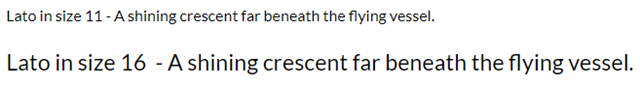
Font size matters. In general, a size 16 pixel font is easier to read over that a size 11 font.
Tone of Voice
Many brand standards also mention tone of voice, defined as a specific vocabulary to maintain a consistent website personality. We recommend focusing on writing that is easy to understand, also known as plain language writing. This serves accessibility. For instance, writing to an eighth-grade level – and leaving out internal business terminology -- improves readability and comprehension. MailChimp has a very good Tone of Voice style guide with practical examples.
Navigation
Good navigation relates to Information Architecture. Branding and visual design aids users by enabling users to see and understand the links. Interactive elements, such as links and buttons, should stand out on the page at first glance and they should change in some way when the user hovers over or clicks on the link or button.
This example shows a button first in its static state and then altered by hovering. Some degree of change occurs – the hover is slightly darker – but the difference is too subtle and hard to detect.


The next, more effective, example combines a shape change with a color change to improve accessibility, per a suggestion in the WCAG 2.0 guidelines.


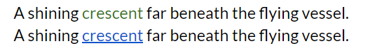
Links within text should stand out from the surrounding text. In this example, the green link blends in with the surrounding text; the blue underlined link stands out.
Review the Final Design
Once your team updates the brand standard to include a website-only section, the new brand standard can guide the visual design and composition. The first website your team creates with this brand standard will demonstrate the ease of applying WCAG guidelines to the creation of an appealing and engaging design. Your accessibility expert should test the composition for color contrast, legibility, and ease of finding links and buttons. You may have to adjust your brand standard to make it all work. That’s okay. A more universally designed and accessible website is worth the extra effort.