


Design determines whether users trust your business or walk away. Websites fail when they feel confusing, outdated, or quietly untrustworthy. The site isn’t obviously broken or wrong, but it sends subtle signals that make users hesitate without fully realizing why.
That’s why website design in 2026 isn’t about avoiding bold or eye-catching design, but about using them with intention to support clarity, credibility, and genuinely helpful experiences. The strongest trends blend thoughtful UX, smart use of AI, and brand-forward creativity to make sites easier to understand, more accessible, and more memorable.
With that foundation in mind, below are the website design trends that will shape 2026.
1. Contextual & Adaptive UI
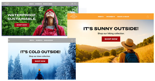
Contextual and adaptive UI (user interface) tailors content and Calls to Action (CTAs) based on a user’s situation, including:
- Time of day
- Location
- Environment or context
- Whether they’re a new or returning visitor
For example, a site might shift homepage hero content based on local conditions, promoting rain gear when it’s raining, winter gear when it’s snowing, and outdoor gear on sunny days. This approach keeps designs focused and intentional while reducing UX friction by surfacing what’s most relevant in the moment.
2. Bite-Sized Content
Bite-sized content isn’t about creating less content. It’s about structuring content so users can understand it faster.
Social media, AI summaries, and feed-style experiences have trained users to skim first and decide quickly where to dive deeper. As a result, dense paragraphs and cluttered sections feel heavier and harder to process.
Bite-sized content works best when information is broken into clear, scannable elements such as:
- Cards and modular sections
- Clear, descriptive headings
- Short lists and grouped content
- Tabs
- Accordions
This approach reduces cognitive load, keeps layouts visually lighter, and allows pages to support depth and SEO without overwhelming users.
A good example of this approach can be seen on the Grammarly website. Their pages break content into smaller, clearly defined sections that are easy to scan as you scroll. Instead of overwhelming users with long blocks of text, information is presented in digestible pieces, making it easy to understand key benefits and explore deeper details only when needed.
3. Vector-Infused Imagery
Vector-infused imagery combines photography with vector illustrations, icons, and shapes to create visuals that feel flexible, expressive, and on-brand. Vectors scale cleanly and are easy to recolor or adjust, which helps strengthen your brand by bringing brand colors forward more boldly and consistently across the site.
When used together, photography and vector elements strike a balance between authenticity and personality. Real photos establish trust, while vectors add warmth, visual interest, and subtle guidance for the eye. Applied consistently across a site, this approach creates a cohesive visual system that feels polished, human, and intentionally designed.
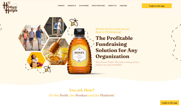
Honey Helps is a great example of this approach in action. The site uses real photography to ground the brand in something genuine and trustworthy, then layers in simple, friendly illustrations to add personality and warmth. The result feels human and memorable without sacrificing professionalism, showing how vector elements can enhance the emotional tone while photography delivers authenticity.
4. Quiet, Invisible AI
Smart Cropping
Quiet, invisible AI improves the experience behind the scenes rather than grabbing attention with flashy features. AI-driven image tools can extend backgrounds, rebalance compositions, or smart-crop photos so the important subject (a face, product, or logo) stays visible across all screen sizes, without a content team manually managing multiple crops.
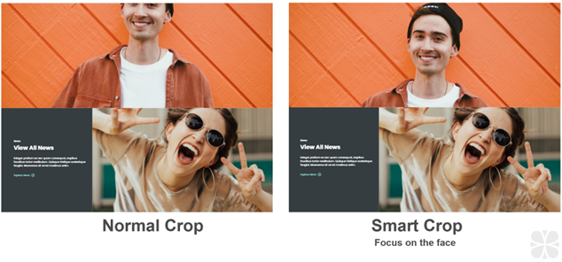
Above is an example showing the difference between a standard crop and a smart crop. In this case, the tablet breakpoint causes the man’s face to be cropped in an awkward way. With smart cropping enabled, you can set the focus on the subject’s face, and the image automatically adjusts across screen sizes to keep the composition intact.
Smart Tagging
AI tools can also move beyond static “related content” based on tags, surfacing items that users actually view or purchase together by learning from real on-site behavior over time. The result is more intuitive, proactive suggestions that feel like the site is anticipating needs rather than guessing – and they continue improving as patterns evolve.
For example, imagine a user visiting a medical equipment website to research surgical lights. With manual tagging alone, the site would likely surface other lighting products and stop there. With AI-driven recommendations, the experience goes further by highlighting items users frequently view or purchase alongside those lights, such as compatible mounts, replacement bulbs, or power kits. This creates a more helpful, professional experience that supports real-world workflows and helps users find what they need faster.
5. Minimalism & Intentional White Space
Minimalism paired with intentional white space strips away non-essential elements so what matters becomes impossible to miss. Generous spacing, clean typography, and restrained color palettes create calm, confident layouts that feel modern, focused, and easier to process.
White space doesn’t need to be literally white – it’s any open space that gives content room to breathe and guides the eye.
When sections become cramped compared to the rest of a page, even strong designs start to feel noisy; adding space can restore clarity and improve usability without changing the core content.
In the example above, notice how spacing is used to separate sections, group related content, and establish a clear visual rhythm as you scroll.
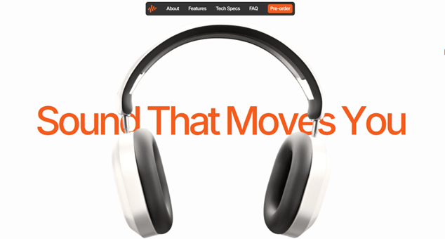
6. Typography as Identity
As layouts become cleaner, typography increasingly carries the visual identity and emotional tone of a brand. Wide lettering, generous spacing, and bold headline styles can make a site feel confident and authoritative while still approachable and welcoming.
Subtle choices, such as using refined serif fonts for headings, can signal editorial polish, luxury, or thought leadership, while simple sans serif type often feels more casual and contemporary. Swapping one font system for another can completely change how a brand comes across, which makes type selection and hierarchy a critical part of 2026 design.
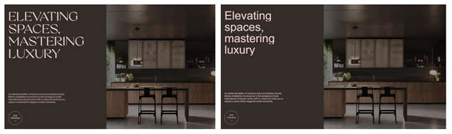
In the example above, the typography alone shifts the tone of the brand. The serif font (the first image) feels elevated and editorial, while the sans-serif font (the second image) feels lighter and more casual.
7. Dark Design
Dark design uses deep tones, shadows, and strong contrast to create focused, immersive interfaces. It uses contrast and restraint to create emphasis, guide attention, and reduce visual noise when the context calls for it.
When applied thoughtfully, darker palettes help key elements like data points, charts, product details, and calls‑to‑action stand out more clearly. This can be especially effective for data‑heavy pages, storytelling experiences, or industries where precision and performance matter.
Dark design is not a universal solution. It works best when supported by strong typography, clear hierarchy, and sufficient contrast for readability and accessibility. For some audiences and content types, lighter designs still feel more familiar and comfortable. The key is knowing when dark design supports comprehension – and when it becomes a distraction.
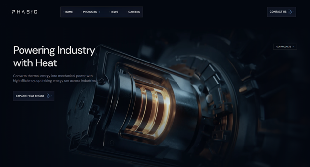
A strong example of this approach is the Phasic Energy website. The dark interface creates a focused, high-contrast environment that allows key content, data, and visuals to stand out clearly. Rather than feeling heavy, the darker palette reinforces precision and technical credibility, helping complex information feel more controlled, intentional, and easier to absorb.
8. Humor & Playfulness
Humor and playfulness are emerging as powerful differentiators in a landscape of look-alike corporate websites. When used intentionally, small moments of personality can humanize a brand, create emotional connection, and make experiences more memorable without distracting from core goals.
This doesn’t mean turning your website into a comedy routine. Subtle humor works best when it feels natural to the brand and shows up in low-risk moments.
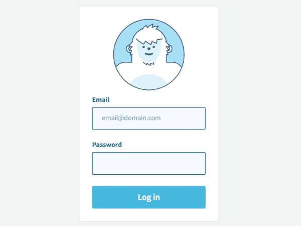
In this example, the humor comes from a character reacting to user actions. As the user types their email, the character watches, but when it’s time to enter a password, the character covers their eyes to give a sense of “privacy.” It’s a small, playful moment that users tend to appreciate. Touches like this help lighten an otherwise routine step, make the brand feel more approachable, and creates a memorable interaction without getting in the way of the experience.
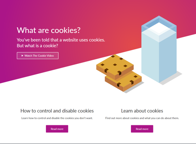
This example works because it takes a dry, technical topic – website cookies – and turns it into something literal and familiar with real cookies and a glass of milk. That unexpected contrast creates a quick moment of humor, making the content feel more approachable. It subtly tells users, “We know this isn’t the most exciting topic, so we’re lightening it up to make it easier to engage with.”
If there isn’t an obvious place for it in primary content, 404 error pages are often a great opportunity to add a light, friendly touch that eases frustration and reassures users they’re still in the right place.
Learn more about our UX design services, and reach out if you need assistance with your next website redesign! To learn more about 2026 website design trends, watch a replay of our Website Design Trends to Watch in 2026 webinar.