


(Originally published August 13, 2015 - Updated April 18, 2018)
Think about your favorite website. What makes it stand out? Layout, colors and photography play important roles, but don’t overlook the equally important elements of typography and font styles.
Choosing a font isn’t easy. Google, Adobe and other tech giants offer a vast array of free web safe fonts, and beyond that lies a world of premium paid and custom typefaces. Where to begin?
Serif or sans-serif? Will the font choice work across screen sizes and devices? Will the site be translated in multiple languages? Does the tone of the typeface match the personality of the brand? Will the font be used for decorative/branded text or extended reading?
Don’t be impulsive. Consider these factors and make an informed decision.
- User Experience: UX stands atop the priority list of any decision about your website, including font design. Your fonts must please your user aesthetically as they lubricate the transfer of information and help your user find, or complete, what they came for. The site designer must ensure color, size, and line height choices allow for legible and readable text that responds across screens and devices. Consider pairing typefaces to add variety and improve understanding of the hierarchy of information. Decorative typefaces that are impactful and support your brand may work well for short headlines but not be optimal for extended reading. Don't forget performance. Balance the number of typefaces and variations within a typeface you choose with page speed and load time, ensuring your selections provide the smoothest web experience possible.
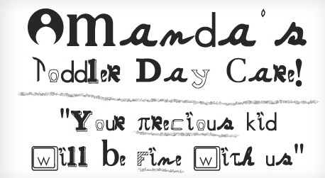
Choosing the wrong font can make it hard for visitors to read your content. (Image via Bonfx)
- Brand Strategy: Online font styles are part of your overall brand strategy and must harmonize with your brand identity, tone and message across all marketing channels.
- Web-Friendly Fonts: Ten years ago only a handful of fonts were web-safe, meaning that they would display consistently on multiple browsers. The @font-face rule, first specified in CSS2 and now supported by all major browsers, changed that by supporting thousands of font varieties. Even so, browsers do not support all fonts. Some fonts, including many commonly used on print materials, are not considered web-friendly fonts and do not display correctly on the web. Before you transfer a print font to web content, make sure it displays correctly. You might have to find an alternative.
- Font Hierarchy: Define your font hierarchy, from titles to headings to subheadings to body and list copy. Do you want your headline and body text to be the same? How bold should your bold be? Font hierarchy helps communicate your message and distinguishes page elements. Don’t overdo it, though. Limit yourself to two or three font types and colors, so your typography doesn’t distract your reader.
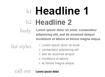
A font hierarchy will help keep your typography choices organized.
- Color and Contrast: Text and background colors affect readability. Choose colors that optimize readability, play well with the overall look and feel of your site, and harmonize with the tone of your branding. Use a contrast ratio tool to test foreground/background contrast and ensure you are meeting the WC3's Web Content Accessibility Guidelines, the minimum standard for users with moderately low vision.
- Fallback Fonts: Work with your site designer to develop a font stack with fallback font families. These come into play when your end user’s device fails to correctly display your primary typeface. While most web browsers support @font-face, every personal computer and device has a different set of fonts installed. A font stack gives additional control over these variables by offering prioritized options for the web page to display. Your font stack should be presented in this order: ‘preferred font,’ similar web safe font,’ and ‘generic font.’ Limit the list to no more than 10 font families, at least two of them generics guaranteed to work on all devices.
- User Error and a Web Style Guide: If lots of employees add content to your site, provide them with training and a comprehensive style guide for your brand. Your CMS may also support restricting available fonts to those within your style guide boundaries. Randomly italicized words in the middle of a sentence tend to distract -- especially if they’re lime green. So keep in mind that many users go overboard when they enter text on a web page. As you select a font, consider how it looks when it’s bold, italicized, or lime green.
- Audience Reaction and Testing: Measure the results of your font selection with testing and user feedback. Speak to your web development team about conducting user testing and gathering data on your font style selections along with the other design and information architecture choices made in the creation of your web site.
"Typography is one of your greatest design assets. It’s not visual decoration or something that gets added at the end to spice up a design. Good typography gives spirit to words and is a potent mechanism to inform and delight."
- On Web Typography by Jason Santa Maria