


North Shore Health
UX Design | UX Strategy | Website Development
North Shore Health is the largest provider of post-acute care in the Upper Midwest, with 70 centers offering long-term skilled nursing care, short-term rehabilitation, and assisted living services.
The Situation
North Shore Health has trusted Northwoods for several years to manage its digital advertising campaigns and successfully drive brand awareness.
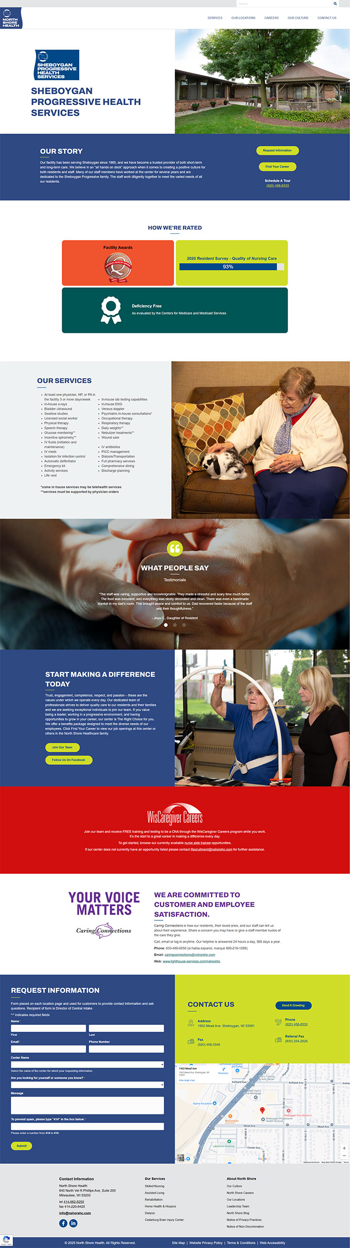
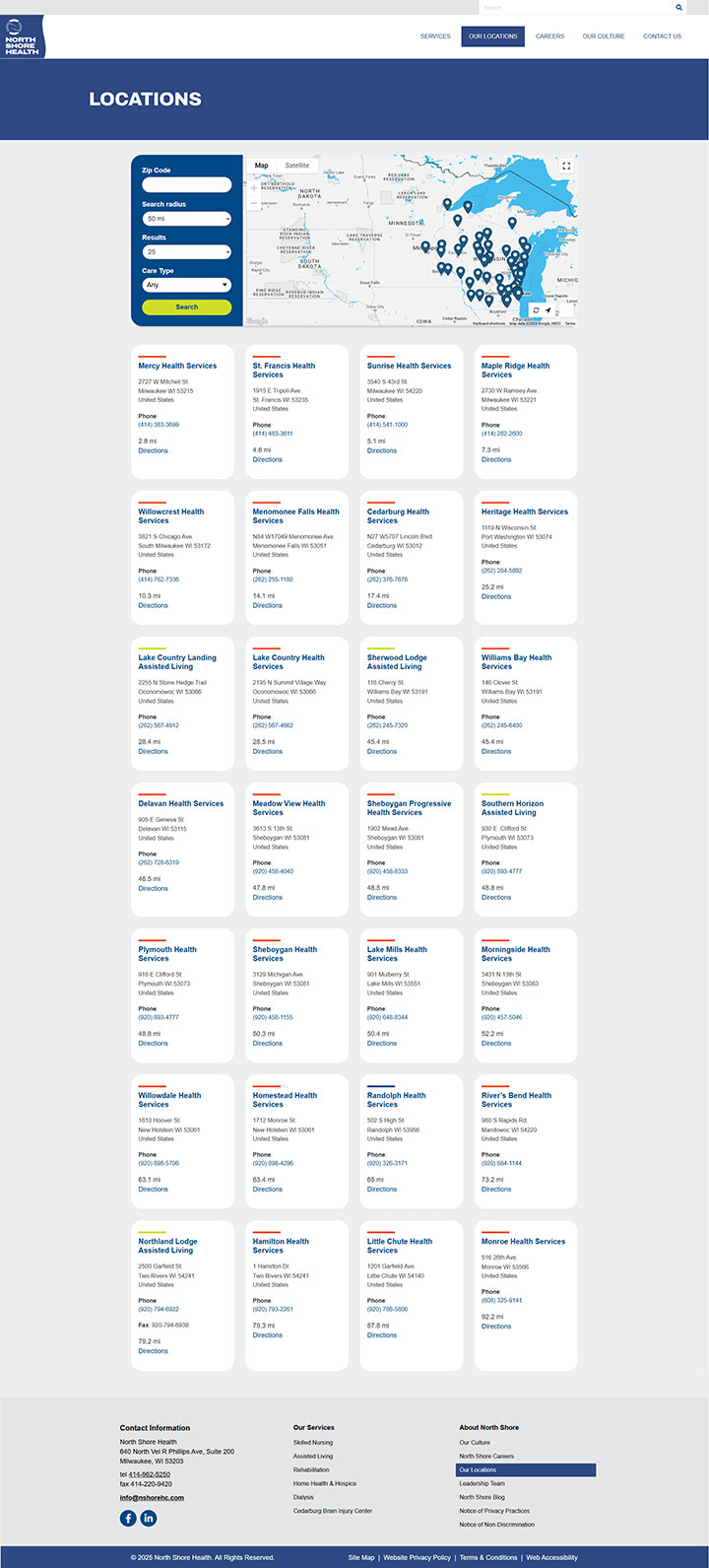
When North Shore Health updated how the names of its healthcare services, its team realized they needed a website redesign to match those changes. They partnered with Northwoods to help with three main goals: update naming across their 70+ assisted living centers, make it easier for visitors to find specific locations, and create clearer calls to action.
As we were finishing the website, North Shore Health decided it needed a more complete brand refresh to fully reflect recent internal changes. This decision came just days before the new site was scheduled to launch. Our team quickly adjusted previous plans and worked flexibly as the project's scope expanded and new requirements emerged.
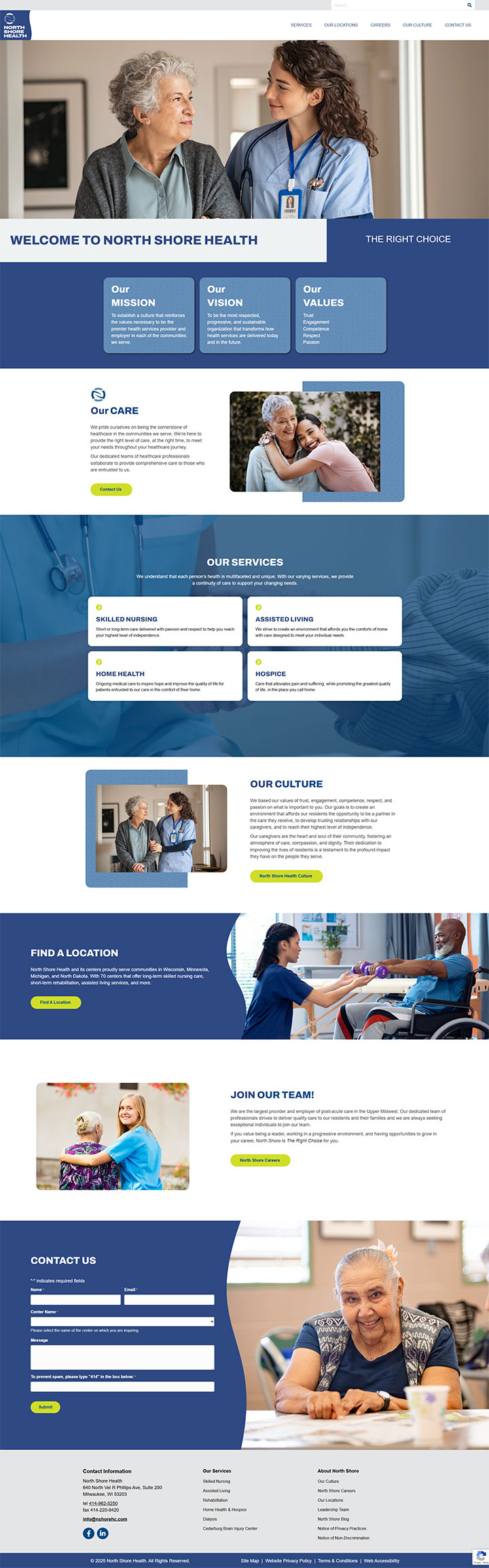
Homepage Design
North Shore Health introduced a new logo featuring a distinctive vertical wave, which became a foundational element of the company’s brand identity. To maintain consistency and reinforce this visual style across their website, our UX team incorporated similar flowing, organic elements in the homepage design.
The Solution
The brand refresh included a new logo, color palette, styles, and design elements that Northwoods incorporated in the new website. With the new site built on WordPress, our developers had already selected a theme and plugins that are highly customizable without requiring new written code. This simplified the process and allowed for quick and efficient changes.
Our development team also improved critical website filtering capabilities. We optimized each location page with new data, color coding, and logos, using conditional formatting to show content specific to each care center.
Overall Design
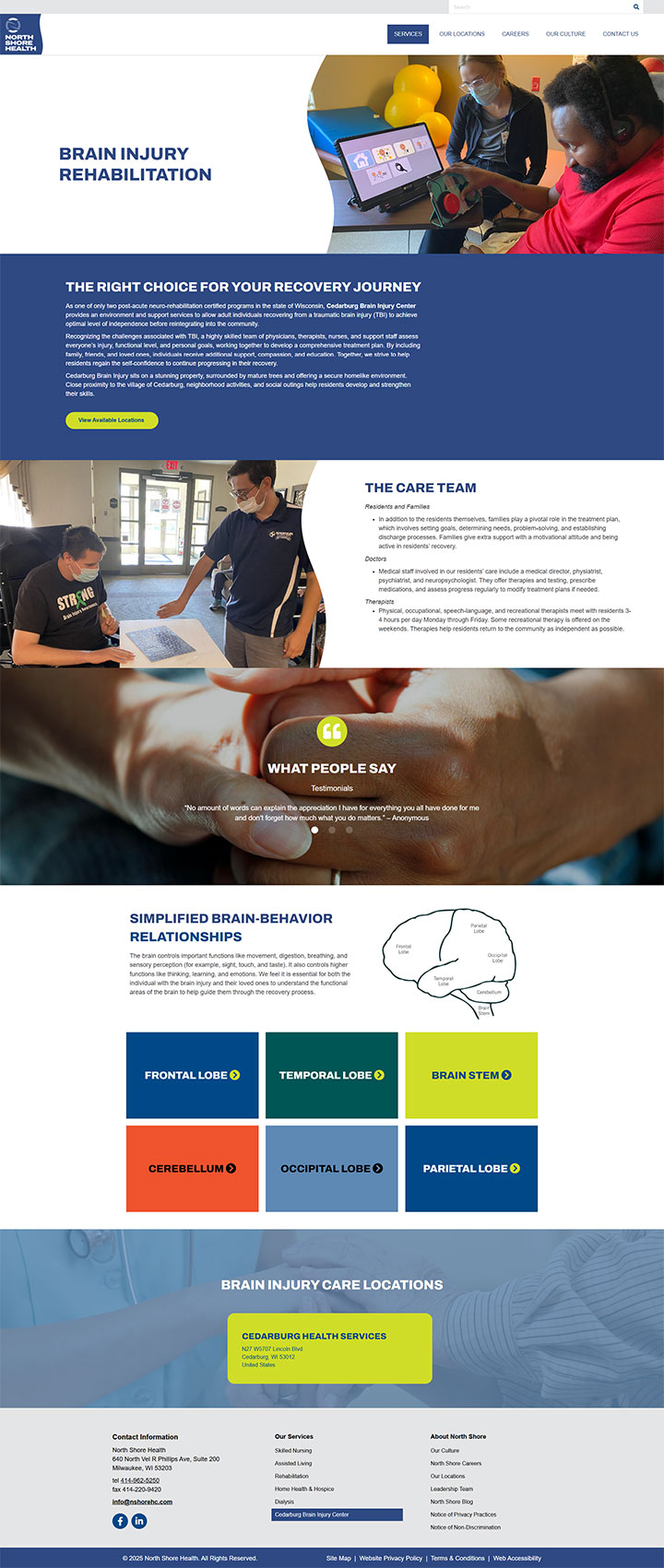
The vertical wave in the logo is referenced throughout the site using rounded edges across various UI components, such as buttons, cards, and section dividers. These softened corners echo the gentle curves of the wave in the logo and create a more inviting, modern, and cohesive aesthetic. By integrating these design elements, we helped North Shore Health ensure that the website feels like a natural extension of their brand, enhancing both visual harmony and user experience.
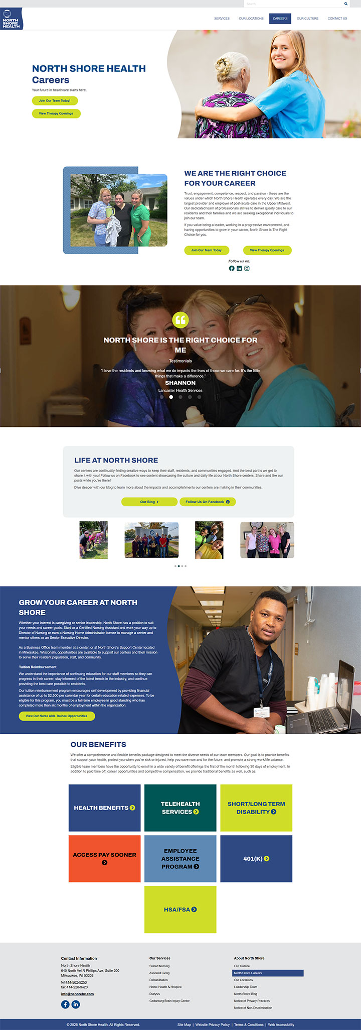
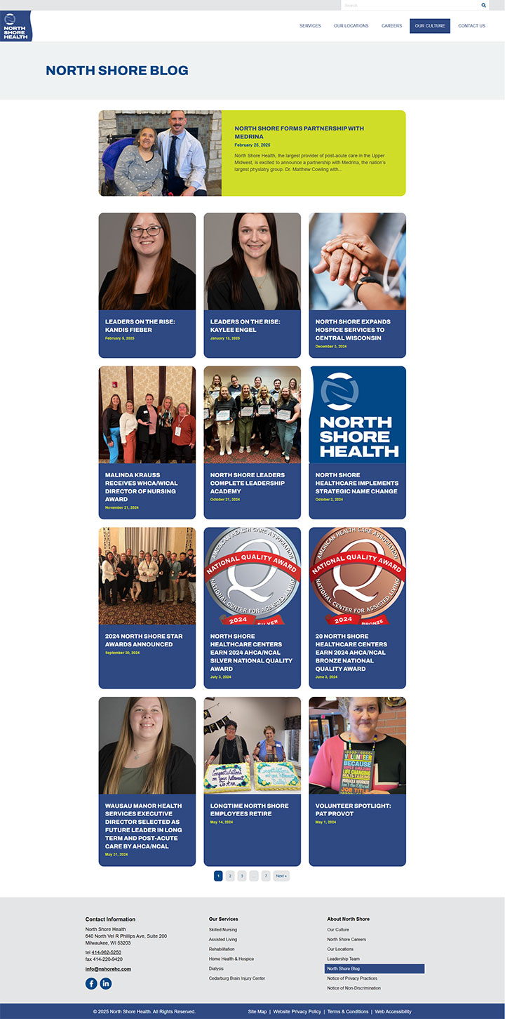
Imagery, colors, and whitespace clearly define each section of content, making pages scannable and easier to digest. Information is structured with prominent calls to action that naturally guide visitors through the site, and we featured several interactive components – such as videos, sliding testimonials, and photo galleries – to help keep users engaged.
Accessibility considerations were woven throughout the design. This includes meeting color contrast requirements, and use of strong hover effects, clearly labeled form fields, video transcripts, proper heading structure, and more. The efforts make the site easier to navigate for users with diverse abilities.
The Outcome
The brand refresh and updated website launched successfully, and the North Shore Health team was thrilled with the results. They now have a polished, user-centric website that seamlessly showcases their new branding while enabling users to quickly and easily learn about services and care options at each of the 70+ locations.
Northwoods continues to provide North Shore Health with ongoing services for both digital marketing and website support, helping them connect with key online audiences and drive continued success in a highly competitive market.