


Waukesha County Technical College
UX Design | Website Development | Accessibility
For more than a century, Waukesha County Technical College, a leader in workforce development, has been preparing students for success within the regional and global economy. Today the College offers more than 150 areas of study, including associate degree, technical diploma, apprenticeship and short-term certificate programs.
Digital Strategy and Website Redesign Improve User Experience
A college website often serves as a school’s main recruitment tool, providing many students with their introduction to academic programs and campus life. The marketing team at WCTC needed their website to create a strong first impression and offer accurate, easy-to-find information for potential students navigating the decision-making process. So, they turned to the digital experts at Northwoods for a website strategy and redesign that would increase application conversions, meet the needs of a diverse audience, and improve the overall user experience.
The Situation
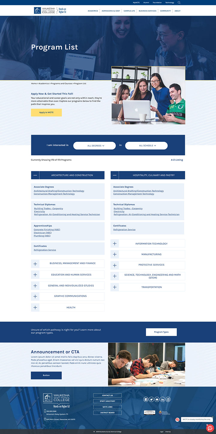
WCTC’s program listing page was hidden behind a lot of unnecessary pages and clicks, making it difficult for prospective students to find.
Large amounts of text pushed key information lower on the page, which resulted in users having to work hard to find the information they needed.
Additionally, it wasn’t easy for site visitors to tell what elements of the program listing page were clickable.
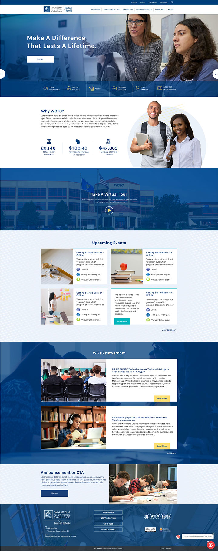
The Solution
A new website was built on Titan CMS, an enterprise content management system powered by Northwoods.
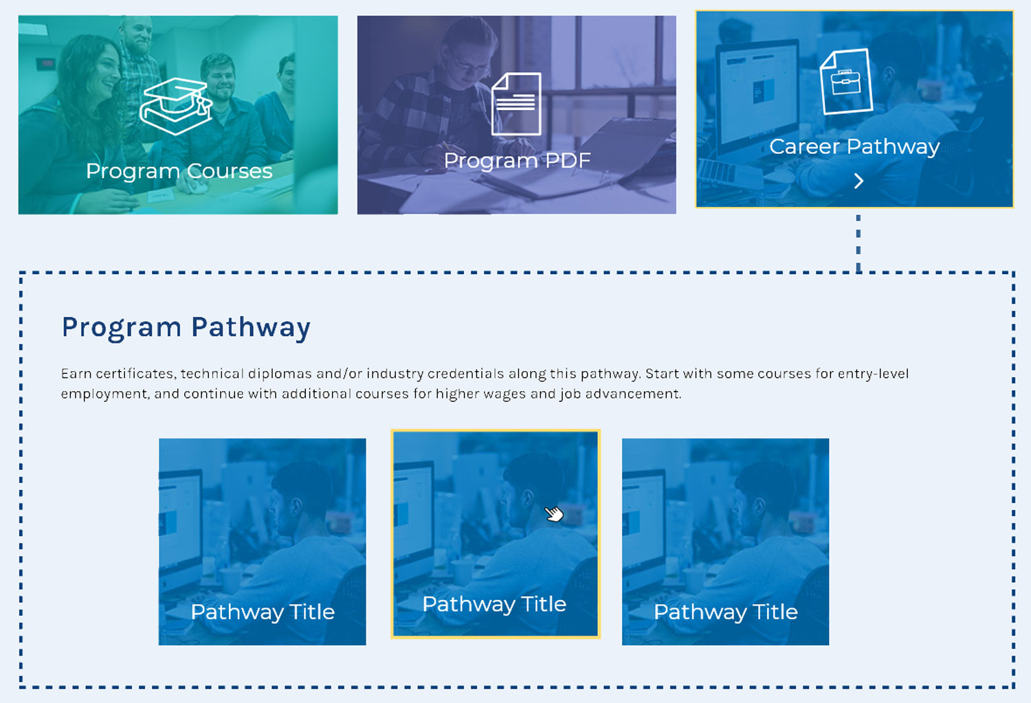
Simple visual cues and movement were added to the program listing page to make clickable elements easily recognizable.
Quick links were added to the top of the homepage to quickly guide users to the most frequently used pages on the site.
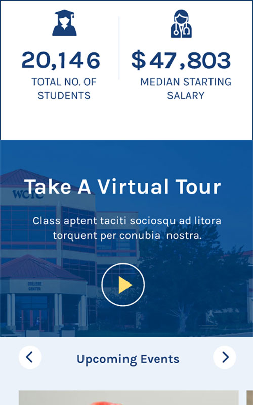
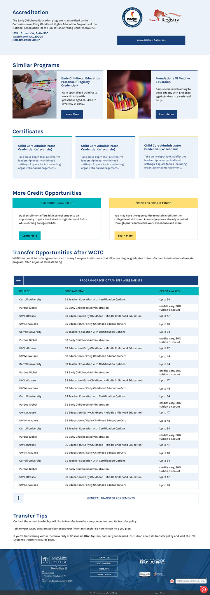
Content is visually grouped together to balance the design and help the user better understand the information.
Movement is an important component of the new design to prevent the website from feeling stale. The content floats up on the page as the user scrolls down to guide their eye to the next section of content, but the movement is subtle enough to avoid distracting from the copy.
Additionally, accessibility was prioritized throughout the redesign to ensure color contrast standards were met, keyboard control incorporated, and descriptive text and alt text added during content migration.

Overall Website Design
Accordions give the user the ability to show or hide content, allowing users to focus more easily on content that is relevant to them. Accordions also help to make scanning content-heavy pages easier.
A stripe pattern is used instead of a solid background to add personality and character to the design. The stripe pattern also shows up in other WCTC marketing materials, which helps to unify their brand identity across all mediums.
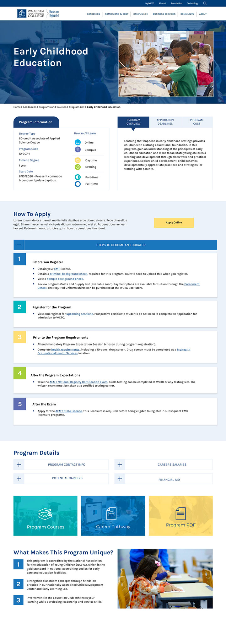
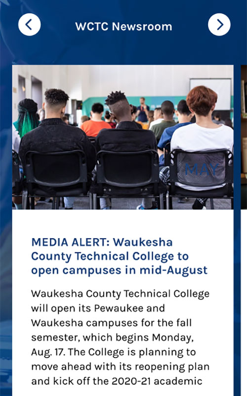
Text, imagery, iconography, and negative space are used to balance each other out to achieve harmony throughout the design. These elements also help to break up the text into smaller, more digestible content blocks that are easier to read and scan.
The design also keeps accessibility at the forefront. For example, hover effects don’t rely on simple color changes alone but also provide small movement to draw more attention to clickable elements for users, including those with disabilities. Elements such as buttons and cards slide up, underlines and borders appear, and icons tilt on hover, as well.
The Outcome
Users can easily and quickly navigate to important pages, such as the program listing page, directly from the homepage, avoiding unnecessary clicks.
Better content organization keeps users from having to scroll to find commonly searched information, improving the overall user experience.
Learn more about the digital strategy that guided the website redesign.