


Updated: June 19, 2023
Originally Published: Dec. 22, 2021
Do users interact with your website as you intended? If they don’t, can they still find what they seek? What links prompt them to click? Do they see your calls to action?
Data is at hand to help answer these key questions about what visitors actually do on your site. Here are three methods for gathering that data.
Method One: Google Analytics
Google Analytics can provide a gold mine of information about your website, so let's start with a few helpful reports to help you understand user journeys through your website. When discussing Google Analytics in this blog, we'll be using examples from GA4, not Universal Analytics (UA), though this data is available in UA, as well. If you haven’t yet transitioned to GA4 from UA, we can help you get started before you begin losing data.
A great place to begin is understanding the starting point of your users. You can access additional detail about key pages where users begin their journeys through your site with the Google Analytics Landing Pages report. The Landing Pages report tells you what pages users visited first. Typically, that’s the home page. More importantly, the pages listed below the home page will provide the greatest value.
If you’re running digital advertisements – and they’re working – the landing page for those ads will show up high on the list because the ads are driving visits to your website. A blog that ranks well in organic search might appear in this report, which offers insight into how well that blog attracts traffic.
Study traffic on these pages, user dwell time, and bounce rates to draw a fairly detailed picture of how users interact with this content.
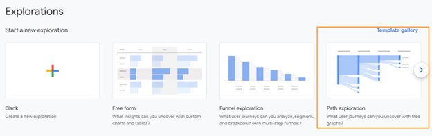
If you’re looking for more information than just landing pages, you’ll need to venture over to GA4’s new Exploration Reports to dive into user navigation in greater detail. From here you'll see not just where users started, but also where they went next.
A great exploration to begin with is the Path Exploration template provided by GA4. This will allow you to dive into your traffic patterns in greater detail.
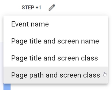
Once in the Path Exploration template, we can choose a starting event. I like to begin with “Page Path and Screen Class,” but if you'd rather sort by page title than URL path, you can select one of the page title options instead.
As a default, you’ll be provided with the most common pages where a session started during your selected time frame. This should line up pretty closely with the landing pages report we just looked at.
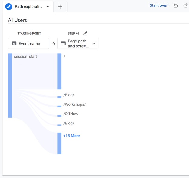
From here, you just need to click on one of the listed pages to see where users typically went next. You also have the option to search for a specific page whose traffic you'd like to dive into by clicking the pencil icon at the top of the column.
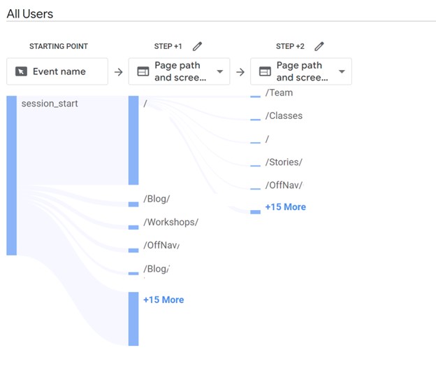
This report is incredibly revealing about how users interact with a single page. The report tells you a great deal about calls to action, especially. Do visitors click on calls to action where you want and expect them to do so? Are they digging deeper than you intend before clicking, or clicking prematurely and abandoning half-loaded shopping carts because of it? There's a lot you can infer by observing user traffic patterns through the website.
Looking for answers to even more specific navigation questions? GA4 Exploration Reports can be heavily customized to provide answers to many specific questions you may have about your website navigation. So, if neither of these reports are displaying the data you need, creating a custom Exploration may do the trick. You may also consider the following methods of gathering data about your users to dive into your website data from a different angle.
Method Two: Heatmaps
Heatmap tools show how users interact with your pages after they navigate to them. (Many heatmap trackers are on the market. We like Hotjar and Clarity.)
Heatmaps represent hot and cold zones on your web pages. Red shows the most user interactions; blue zones show the least. Heatmaps can track many website metrics, but most site owners and analysts focus on highly clicked areas, areas where users concentrate cursor activity, and the depth of user scrolling.
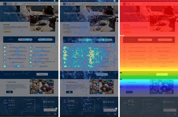
Heatmaps provide context to Google Analytics data. GA reports show you what pages users are visiting, where they’re going next, and how they’re entering and leaving the site, but they can’t tell you what users do when they get to those pages. Heatmaps fill that gap by visually displaying what users click on and where they look before going on to the next page.
Many heatmap tools also record video, so you can see exactly how long users linger in various temperature zones and where they interact most frequently.
Method Three: User Research
Data alone can’t tell you everything. Even after you analyze these GA reports, some user behaviors might seem to make no sense. Why do users click on that blue button versus the red link? Why do users visit this or that page so often? Sort it out and fill the gaps by going to the source: your users.
Survey your key customers. Ask them what they think of your website, what pages they visit most, and why they want to visit your website. Craft specific questions that data raise but fail to answer.
Even anecdotal, informal user input can help. Encourage your sales reps to ask customers a few quick questions about your website. Your customers are stakeholders; insight from them can inform your decisions, strategy and tactics.
Direct user comment combined with interpreted data can tell you what users think they want, what they really need, and what they do at your website. This information can guide you to an improved site that attracts prospects, converts those prospects into new customers, and keeps your current customers satisfied.
If you need help understanding how your users are using and navigating your website, we can help! Don’t hesitate to reach out to us for assistance.