


Updated: Feb. 23, 2026
Originally Published: Aug. 12, 2024
Website traffic doesn't pay the bills. Conversions do. So why do so many consumer sites make it so hard for users to get to and click on that BUY button?
Numerous pitfalls turn potential customers into lost opportunities in just seconds, but let’s focus on the top five common UX mistakes and fixes that will keep your visitors happy, engaged, and headed for the checkout.
1) Forcing Account Creation Mid-Journey
Problem: Forcing users to create an account before making a purchase can frustrate buyers and cause them to abandon their carts altogether.
First-time visitors often arrive simply to explore your product and evaluate your brand. It’s a first date; they’re not ready to commit to your brand, and creating an account can feel like asking for exclusivity before they've even decided they like you.
Solution: Allow users to complete their purchases by checking out as guests, and then offer the option to create an account. This approach reduces friction during the checkout process and can still capture valuable user data. Users will take the time to set up accounts when they feel ready to commit to your brand.
Example: Chewy, the online pet supply retailer, offers three options at the beginning of the checkout process:
- Sign in to an existing account
- Create a new account
- Proceed with guest checkout
This flexible approach lets customers select the method that works best for them. The guest checkout option reduces friction for new or occasional shoppers, who may be reluctant to create an account. And it still offers the benefits of account creation for those interested in a more personalized shopping experience.
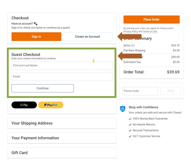
Chewy's Checkout Panel
2) Hidden Fees
Problem: Online shoppers want transparency, and they want it up front. Unexpected costs, especially shipping fees, at the very end of the checkout process, erode customer trust and kill sales. Surprise fees don’t sit well with visitors who have entered all their information during the checkout process. Customers perceive them as a bait-and-switch tactic rather than a simple oversight. These fees annoy them to the point of abandoning carts just before the finish line.
Solution: Don’t hide fees. Present all of them early in the shopping process. This can be as simple as displaying estimated shipping costs on product pages or right in the shopping cart. When buyers understand the full investment from the start, they feel in control of the decision. Showing all costs early sets correct expectations, builds trust, and reduces last-minute abandonment at checkout.
Example: Airbnb addresses this issue by displaying the total price, including all fees, in the search results and listings. All-in pricing shows users the full cost from the start. A detailed breakdown shows the nightly rate, cleaning fee, and service fee before booking.
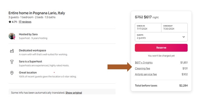
Airbnb's Checkout Panel
3) No Clear Return Policy
Problem: An unclear or hard-to-find return policy can stop potential buyers who are still on the fence about your product or even about your brand. A clear, fair, up-front return policy gives them peace of mind – lowering perceived risk, building trust, and making customers far more comfortable completing their purchase.
Solution: Include a link to your return policy on product detail pages and/or within the footer of your website. Consider placing it near key decision points, such as the Add to Cart button, so shoppers see it when they need reassurance most. Write the policy as simply as possible, using clear, human language instead of confusing legal jargon.
Example: Nordstrom, a leading retailer in the e-commerce space, prominently displays its return policy on every product detail page. It also provides, in the website footer, a clear link to further information on return policy and exchange options. Nordstrom offers a generous return time window and free return shipping. Customers are more likely to buy if they have easy recourse if a product doesn’t work out.
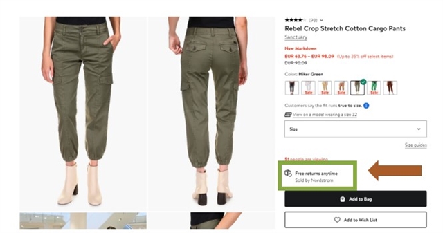
Nordstrom's Return Policy Note Within a Product Panel
4) Poor Product Descriptions
Problem: Online shoppers can’t try on a dress or feel the weight of a power drill. They rely heavily on product descriptions to inform purchasing decisions. Vague product descriptions that lack detail and useful visual elements can confuse buyers, and confused buyers hesitate and abandon carts. Even worse, if they do purchase, they may discover the product isn't what they expected, leading to frustration, negative reviews, and costly returns.
Solution: Detailed product descriptions build trust and credibility with customers. They demonstrate that you understand your products and are committed to providing transparent information. Clearly outline the key features, specifications, dimensions, materials, and any other relevant details about the product.
Example: Sephora, a leading retail company of beauty and personal care products, provides valuable and useful product information, including ingredients, usage instructions, and product highlights. High-quality images and videos showcase beauty products. Sephora helps customers make informed decisions.

Sephora Product Description
5) Ineffective Search and Product Discovery
Problem: Even when a search bar exists, it doesn't always work well. If users must dig through menus and categories to find specific products, the experience becomes time-consuming and frustrating. This is especially true for shoppers who know exactly what they want but can't locate it quickly. When discovery requires too much effort, patience runs out. Customers will leave and head straight to a competitor whose site makes finding products simple and intuitive.
Solution: Add a visible, easy-to-find search box to your website and product listing pages. Make sure it delivers fast, accurate, and relevant results. Ensure your internal search engine indexes all meaningful content, including product descriptions, categories, and metadata. Support features like auto-suggestions, synonym matching, and tolerance for common misspellings.
Regularly review search queries and user behavior to uncover gaps, trending terms, and products users struggle to find. Use those insights to refine your search experience and continuously improve product listings and descriptions.
You may also consider using AI-assisted search to improve discovery by understanding intent, handling natural-language queries, and surfacing relevant products faster. When implemented thoughtfully, AI search can reduce friction without replacing familiar search patterns.
Example: The product search on the premier race car bodies and performance parts site Five Star Bodies product listing page perfectly complements its filtering options. It gives users a quick, efficient way to find specific products without browsing through all offerings. Quick product discovery leads to quick sales and, perhaps, to enough good feeling about your brand for the visitor to commit to creating that personal account – after checkout.
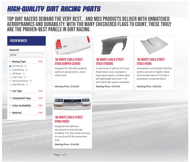
Five Star Bodies Integrates Search Engine and Filter Functions
Final Thoughts
An enjoyable user experience is essential for B2C websites that need to drive users to purchase. Most e-commerce and B2C website visitors are careful about where and how they spend their hard-earned money; adding unnecessary hurdles to the buying process will surely give them pause before purchase. Don’t let that happen! By implementing the solutions outlined above, you’ll reduce friction in the purchase process, achieve your sales goals, and drive brand loyalty.
If you need help identifying obstacles to purchase on your B2C or e-commerce website, Northwoods can help. Learn more about our UX strategy and UX design services and reach out to us to schedule a complimentary consultation.