



Every website owner wants to know: What are people actually doing on my site?
Google Analytics can tell you how many visitors landed on a page and how long they stayed. But analytics can't tell you why they were there, where their eyes went first, how far they scrolled before giving up, or what non-clickable items they kept trying to click.
That's where heatmaps come in. By turning raw behavioral data into visual, color-coded patterns, heatmaps bridge the gap between what analytics report and what users experience.
What Are Heatmaps?
Heatmaps are a visual representation of user behavior on a webpage that uses color gradients to show where activity is most concentrated. Warmer colors, like red and orange, indicate high engagement, while cooler colors, such as blue and green, indicate lower activity.
Heatmaps overlay this data directly onto screenshots of your website, so marketers and designers can see how users navigate the layout and interact with text, images, prompts, and other page elements. User behavior aggregates into visual patterns, which heatmaps make understandable at a glance.
Here are common types of heatmaps, each capturing a different dimension of user behavior.
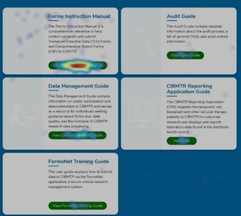
Click Heatmaps
Click maps show where users click. They highlight popular buttons, links, and images, as well as futile clicks on non-interactive elements.
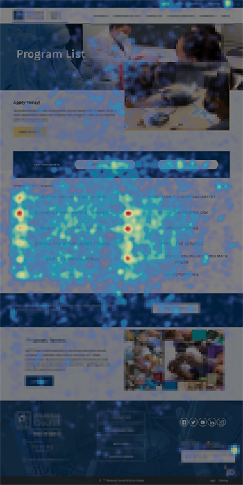
Move Heatmaps
Move maps track mouse movement, which often correlates with users’ eye movements and areas of focus as they examine a web page. Note: these maps apply only to desktop computers, not mobile devices.
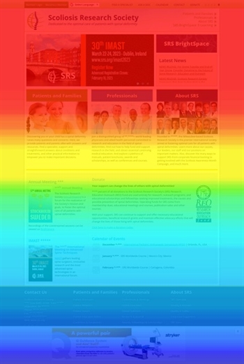
Scroll Heatmaps
Scroll maps reveal how far down the page users scroll before leaving that page, helping identify at what point content starts losing attention. Scroll maps use color gradients to highlight the most-viewed content and show what percentage of users reach your calls to action.
Together, these different map types help paint a more complete picture of how visitors engage with your webpages.
What Are the Benefits of Heatmaps?
If you've ever wondered what users actually do on your website versus what you assume they do, heatmaps offer a direct answer. By visually mapping clicks, scrolls, and attention patterns, they take the guesswork out of UX and content decisions.
Heatmaps allow you to:
Visualize user behavior instantly: Heatmaps turn raw clicks, scrolls, and attention data into color-coded visuals that are quick and easy to interpret.
Spot friction points fast: Quickly identify where users get stuck, ignore key elements, or click on things that aren't interactive.
Validate design decisions with evidence: Replace guesswork with real user behavior data to support UX and content choices.
Reveal underperforming content: Heatmaps show sections of a page that go unnoticed or unused. Once identified, this content can be cut or, if it’s truly important, highlighted to increase visibility.
Reveal the "why" behind analytics: Pair heatmap insights with traditional analytics to understand not just what's happening, but why users behave the way they do.
How Do You Use Heatmap Data?
Collecting heatmap data is just the starting point. The real value comes from translating those visual patterns into concrete changes. Here are a few common issues that arise when we review heatmap data, along with some practical advice on what to do about them.
Look for drop-off points. Scroll maps in particular are useful for identifying where engagement drops sharply. If most users never scroll past 30% of a page, make sure your most important content is above that drop-off point.
Compare intended vs. actual behavior. Click maps often reveal "rage clicks" or attempts to interact with elements that aren't clickable, such as bolded text or images users assume to be buttons. This signals a confusing visual design. Test new designs and layouts to calm the rage and eliminate the frustrating click attempts.
Cross-reference with other data. Heatmaps are most powerful when paired with analytics, session recordings, and user surveys. If analytics show a high bounce rate on a landing page, a heatmap can help explain why by providing the missing piece.
Context and broad background knowledge matter here. Before you can usefully track click/scroll patterns on a given page, you need to know which pages to track. That depends on understanding the intent behind users’ visits and knowing which pages draw the most traffic. Without that analytics and survey data, it can be difficult to narrow your focus. It's also hard to tell whether the click patterns you see actually relate to why users came to the site in the first place.
Segment when possible. Behavior can vary significantly by device, traffic source, or user type. Heatmaps segmented by mobile vs. desktop, for example, often reveal very different engagement patterns, which a single, blended view would mask.
Turn insights into action. Heatmaps reveal patterns of use. Those patterns should drive specific design and UX recommendations. This could include moving a call to action above the fold, removing a distracting design element, or restructuring content hierarchy based on where user attention naturally falls.
What Are the Potential Pitfalls of Heatmaps?
Heatmaps are useful, but they don’t tell the whole story on their own, and they can be misread.
- They show what, not why. Heatmaps can tell you users aren't clicking a button. But what stops them? Didn't notice it? Weren't interested? Didn't trust it? Qualitative context research – surveys, interviews – can answer those questions. Heatmaps alone can’t.
- Aggregated data can hide important nuances. A heatmap that tosses desktop and mobile traffic or new and returning visitors into the same pot can blend distinct behavior patterns into misleading averages.
- Sample size matters. Heatmaps built from a small number of sessions can reflect noise rather than genuine patterns. Low-traffic pages need longer collection windows to yield reliable data.
- They only capture on-page behavior. Heatmaps can't account for factors like site speed, external referral context, or a user's intent before arriving, all of which shape behavior in ways the heatmap alone won't reveal.
- Visual bias can skew interpretation. It's tempting to focus on the hottest areas of a heatmap and assume they represent success. Not necessarily so; those concentrated areas may indicate confusion, such as repeated clicks on a broken link.
- They require regular refreshes. Heatmaps taken before a redesign or content update quickly become outdated. Base decisions on current data, not last year's snapshot.
Get Started with Website Heatmaps
Heatmaps are one of the most accessible ways to see your website through your users' eyes. They're especially powerful when it comes to spotting friction, validating design choices, and communicating findings to stakeholders who respond better to visual evidence than raw numbers.
That being said, heatmaps work best as one piece of a larger research toolkit. Paired with analytics, session recordings, direct user feedback, and more, they help build a fuller, more accurate picture of how people actually experience your site.
Not sure where to start? Our UX research team can set up, interpret, and act on heatmap data for your site, so you spend less time guessing and more time improving what matters. Reach out to learn more!