


Launching a new website is exciting. Keeping the user experience intact over time, however, is a challenge.
Websites do not stay strong on their own. They need oversight, because without it, small UX deviations will inevitably creep in. They often go unrecognized, because changes can feel helpful, reasonable, and even necessary in the moment. But they accumulate and subtly erode your user experience.
How Good Website Design Slowly Falls Apart
Websites rarely break all at once. They unravel gradually, and not because teams are careless. It happens because stakeholders have different priorities. New campaigns demand visibility. Content grows or changes. Leadership shifts. Quick updates bypass process. And sometimes, someone simply says, “Just this one page needs to be different.”
Separately, such decisions make sense. But users experience your site holistically, not as loosely connected one-offs. This means your navigation, layout, interactions, and content hierarchy need to work together. When small changes begin to add up, the overall structure starts to change.
Below are three examples of erosion and how they can affect your website users.
1. Navigation Bloat
How it starts:
- A new service launches.
- A leader wants more visibility.
- A team wants easier access to something important.
It’s often a simple request:
“Can we just add this to the main nav?”
So, one more item is added.
Then another.
And another.
The primary navigation grows from six items to nine. Labels get longer. Then the flyout menus start to appear, stacking complexity on top of complexity and turning a once simple navigation into a maze.
From the inside, it feels like improved visibility. From the user’s perspective, it’s overwhelming. More choices increase cognitive load, scanning takes longer, and user decision-making becomes harder. Your previously clear navigation has gone blurry.
This is because navigation is not just a list of links. It showcases your understanding of users’ priorities and should intentionally serve those priorities. Without discipline, your navigation slowly transforms from a useful guide into a content dumping ground.
Do this:

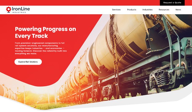
The original navigation stays light and airy, allowing the hero image to break into that space and add visual depth.
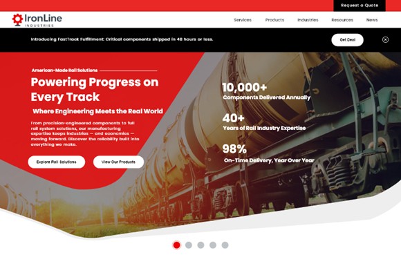
Don’t do this:

With two packed rows of navigation, the header becomes too heavy and crowds the hero image, disrupting the layout's visual flow and overwhelming the user before they even reach the content.
Solution:
- Instead of immediately going to the navigation, try adding more calls to action. Understanding how your users navigate your website can help you determine the best place to highlight the new content.
- If navigation placement is necessary, add it within an existing section or drop-down that aligns with the topic. Avoid creating flyout menus, which add unnecessary layers of decision-making and increase cognitive load.
- If something doesn’t belong in the navigation, highlight it where it naturally fits within the site. For example, feature a new service on the Services landing page. Promote a new resource within the Resources section. Highlight a new initiative on the homepage or in a content area where users already look for that type of information.
2. Everything Is “Above the Fold” (And the Slider Multiplies)
Everyone in your business genuinely believes their content matters, which is a good thing. Marketing wants campaign visibility, leadership wants initiatives highlighted, sales want stronger calls to action, HR wants recruiting featured, and product teams want new offerings front and center.
So, the top of the homepage grows. Content managers start adding:
- A bold hero headline announcing the most important message
- A supporting subhead explaining the value
- Two competing call to action buttons
- A row of quick links trying to shortcut the journey
- Stats to tout credibility
- Promotional banners pulling attention in yet another direction
And when space runs out?
Just add a slider, right?
Now instead of prioritizing content, the homepage rotates through five competing messages. Each one important. Each one fighting for attention.
But users rarely engage beyond the first slide, and when everything is highlighted, nothing stands out. Strong UX depends on hierarchy, and without someone protecting that structure, the homepage slowly degrades from focused guide to crowded billboard.
Do this:
Strong UX doesn't need to say everything at once. A clear headline, a single CTA, and a nav that stays out of the way does the job.
Don’t do this:
A promotional banner, pre-heading, headline, subhead, body copy, two CTAs, three stats, and a slider. Every team got what they wanted. The user got noise.
Solution:
- Users know how to scroll. Trust that if they don’t see what they need above the fold, they will keep scrolling.
- Consider adding tabs or accordions of content that allow users to easily view all the information available, without the noise of reading through it all. Help them focus on what they need.
- Trust your site’s navigation. If your users don’t find what they need on the homepage, they will use your website search or look through navigation. Maybe you need to focus on cleaning up your navigation instead of cramming everything above the fold.
3. Layout Creep (Pattern Drift)
At launch, a clean, consistent page layout works beautifully across the site. Sections follow a predictable rhythm: headline, short intro, three supporting cards, and a clear call to action.
Until one page needs “just a little more.”
A fourth card is added. Then a fifth.
A different page introduces a horizontal carousel to fit everything in.
Soon the pattern is gone.
Now:
- Sections expand unpredictably.
- Cards stack unevenly.
- Some pages have three columns, others four, others five.
- The visual rhythm disappears.
The original design created consistency and scan-ability across the site. But then individual pages begin bending the layout to fit more content, and the system slowly breaks down. One exception becomes the new pattern—with zero intent behind that design.
Do this:
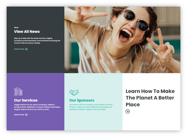
The grid earns its energy from contrast. A high-impact photo anchors the layout while lean, focused copy in each block keeps the eye moving and the page feeling open.
Don’t do this:
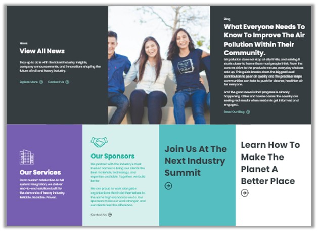
Adding more content without considering how it fits the grid breaks the layout fast. Long headlines wrap awkwardly, body copy throws off card heights, and a group photo replaces the bold single image that gave the layout its energy. The sections stop feeling like a cohesive grid and start feeling like a patchwork.
Solutions:
- Prioritize what truly belongs on the page. Not every item merits equal visibility. Highlight the most important content within the primary layout and move secondary items to supporting sections, related pages, or deeper navigation paths.
- Break content into multiple sections instead of expanding one layout. If a section begins to exceed what the pattern was designed to support, split it into additional rows or group related items under subheadings. This preserves readability and keeps the layout rhythm intact.
- Protect the core layout patterns. Define a small set of approved grid options (for example, two-, three-, or four-column layouts) and avoid creating new variations every time a page needs to hold more content. Consistency across pages is more valuable than squeezing everything into a single section.
What Do Design Rules Actually Look Like?
Clear design rules help maintain consistency as a website grows. These guidelines may include:
- Limits on the number of primary navigation items
- Defined grid structures that should not be altered without review
- Rules for how much content belongs in a hero section
- Approved card layouts and image ratios
- Recommended character counts for headlines, summaries, teaser texts etc.
- Consistent spacing scales between sections and elements
These rules are not restrictive for the sake of control. They exist to protect hierarchy, readability, and clarity. When teams understand the boundaries, creativity can still thrive within them without compromising the overall experience.
Special note: If certain content is expected to fluctuate frequently, let your design team know about it early. They can usually build in flexibility to accommodate this type of change.
Protect The Design to Protect User Experience
The danger isn’t one deviation. It’s cumulative deviation. Small changes increase design debt, create subtle usability friction, dilute brand credibility, and slow future improvements. The sure sign of cumulative deviation? Someone says, “Our site just feels messy.”
The mess didn’t happen overnight. It formed one exception at a time. Remember that a website design is not just a visual layer, it is a structured set of decisions. If no one is responsible for protecting those decisions, the structure gradually weakens.
Maintaining design integrity isn’t about blocking new ideas. It’s about asking questions:
- Does this follow an established pattern?
- If not, should we evolve the pattern intentionally?
- What happens if everyone asks for this?
- How will this affect users across the entire experience?
A professional website isn’t defined by how it looks at launch. It’s defined by how well its structure holds up over time.
So who’s protecting your website’s design?
Your website's design is only as strong as the structure behind it. If you're noticing inconsistencies creeping in — or want to get ahead of them before they do — Northwoods can help. Learn more about our UX strategy and UX design services and reach out to schedule a consultation.