


The essential book on web usability, Don’t Make Me Think: A Common Sense Approach to Usability authored by Steve Krug, was published more than 20 years ago. But designers and developers still rely on it today as a guide to make their websites user friendly.
How has this book stood the test of time when the Internet has evolved so much? Users still use the Internet in many of the same ways as they did in the early 2000s. (An updated version of Steve Krug’s original book was published in 2013 to address mobile design but the original fundamentals didn’t change.) So, while design is ever-changing and constantly evolving, the fundamentals of usability are still critical and applicable today.
When It Comes to Web Usability, Go Back to the Basics
While the following usability best practices may seem simple, they can be surprisingly difficult in practice. Guided by the principles in Don’t Make Me Think, here are four main fundamentals that every designer and developer should keep in mind.
1. Clearly Explain Who You Are and What You Do
This one seems obvious, but companies sometimes think they need to build their website only to meet their current customers’ needs; in reality, it’s important to build a site so that someone who’s never heard of your brand will understand quickly who you are, what you do, and what a user can accomplish on your site.
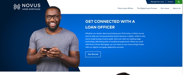
The example above is from a website we designed for Novus Home Mortgage. Visitors to the home page are greeted with clear indications of who Novus is (a home mortgage company), what they do (connect you with a loan officer), and what a user can do on their site (find a loan officer).
Key Takeaway: Users’ attention spans are short. Make it easy for your site visitors to quickly understand what you do, who you serve, and how you help them accomplish their goals.
2. Use Clear Navigation
Think of the navigation as road signs – you should always know where you are and where you can go. Your main navigation should be simple, uncluttered, and offer clear direction. Think of page titles as street names. Here’s an example:
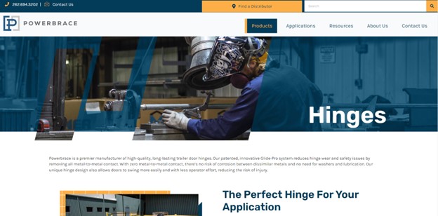
When you land on one of Powerbrace’s website pages, you quickly see from the main navigation that you’re in the products section, and within products you’re viewing the Hinges page. This is easy to see because those indicators are above the fold and designed purposefully so the user knows where they are without needing to scroll to find out. Remember, don’t make them think!
Key Takeaway: Not all site visitors will enter your site through the home page. Help them immediately understand where they are in your site structure through the use of specific design cues, navigational elements, and layout.
3. Keep Content Short
This one is difficult for many marketers and the companies they work for. Why? Because we have so much valuable information we want our customers and site visitors to know! But the more text you include on a page, the more likely people will give up before they find the information they need.
People scan. Krug says you need to think of websites like billboards – you only have a few seconds to get your message across. Most people won’t stick around to read big blocks of text. In fact, many of you probably skipped right down to the example below and may not even be reading this now. That doesn’t mean you need to leave out important information – it just means that you need to organize it to be scannable.
(Did you notice that I mentioned above that many of you would skip down to the example without reading the full paragraph? No? That proves my point!)
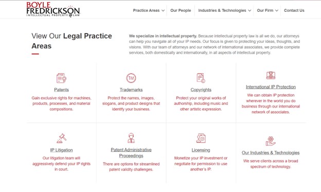
People scan website pages for the information they want, but that doesn’t mean you need to omit all critical content to make it user friendly. In the example above from the Boyle Fredrickson website, a visitor can easily see what areas of the law the firm specializes in. By incorporating visual icons, the content is organized perfectly so that a quick scan gives visitors practice titles, a brief description of each, and a link to another page to learn more.
Key Takeaway: Reduce text, and then reduce it some more. In general, text-heavy websites are difficult for users to scan, which reduces comprehension and decreases engagement. Use design and text elements to provide content hierarchy and visual cues that give users the information they need to keep them engaged and moving through your site.
4. Make Clickable Items Clear
This is another usability best practice that seems obvious, but with website design becoming more creative, clickable website elements have expanded past buttons to blocks, images, icons, and more.
Users don’t want to have to guess what they can click on, so make clickable elements clear by changing the color, or using underlines, backgrounds, or borders.
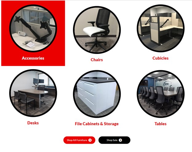
In this example from the Office Furniture Resources website, as a user hovers their mouse over various elements in this section, the background of clickable elements turns red, and the pictures pulse. While not a typical looking button, these purposefully created design enhancements make it clear to the visitor that they can click on the accessories box, for example, and be brought to a page with more detail.
Key Takeaway: Make it easy for a user to understand what elements of your webpages are clickable. For many users, it’s not always easy to tell – especially if your site visitors have visual impairments or other disabilities that make navigating websites difficult.
Final Thoughts
Steve Krug’s fundamentals play just as key a role today as they did when first introduced more than 20 years ago. With today’s design changing rapidly and becoming more experimental, it’s critical to keep these four fundamental rules in mind when designing, or redesigning, your website.
Users don’t want to have to think; they just want to quickly find what they’re looking for. Make that as easy as possible in the few seconds you have to make a good impression.
If you need help with website design, Northwoods’ UX, UI and website designers have the expertise and experience to create a user-friendly, beautifully designed, and functional website that will help you achieve your goals. Reach out to us today!