


Updated: November 2, 2021
Originally Published: April 27, 2017
Scrolling transformations, parallax animations, advanced micro interactions and so on – make websites exciting and engage the audience.
However, high-design concepts, if recklessly applied, can degrade user experience (UX). Users shouldn't have to think too much when they visit your site. Your user interface (UI) should help users absorb and navigate content intuitively and accomplish their goals with little effort. That’s the essence of good UX.
How do we know if users are enjoying our interface as we hope they will? We can ask them through research, both active (interviews and testing) and passive (analytics).
Know What Devices Your Users Prefer
Mobile use continues to rise, so we should design for mobile first, right? That’s the trend.
Not so fast. Know your users. Your primary audience could be sales teams armed with company-issued tablets when visiting clients onsite. Or parked at desks in front of component keyboards and larger screens. Design first for the device that fits your users.
If most users browse through Chrome or Edge, test UI and functionality more in depth with those browsers before testing with web browsers that most users ignore.
What works on one device type or browser does not necessarily work on another. Don’t assume that your website will look perfect on every device, in every screen size, on every browser. Understand the preferences of your target audience and tailor UX and UI design to them. This understanding is not hard to achieve; just grab the info from such web tools as Google Analytics.
Navigation Trends that Improve UX
In a recent study, 94% of site users named easy navigation the most important website feature. So don’t waste time and energy developing a unique navigation that differs substantially from the norm. Don’t frustrate users by making them learn an unfamiliar navigation scheme.
Enhance navigation without confusing users. A mega menu – done well, with a clean grid layout – shows the main areas of the site in a single view that the viewer can scan quickly. Structure the content in a way that does not overwhelm users, a way that promotes quick, intuitive, fruitful scanning. Images can help, if they aren’t too distracting and provide additional insight for the user.
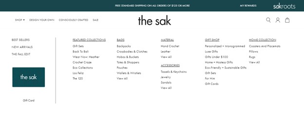
The clean grid layout in the above mega menu from thesak.com serves users well.
Avoid clutter in mega menus and avoid flyout menus in drop-down navigations. Too many options upfront make users work too hard to find the information they need. And that leads to frustration.
Not every site needs a mega menu. Mega menus can be perfect for a site with hundreds of pages, but they tend to be overkill for sites with less than 30 pages.
More ways to enhance UI through better menus:
- Use unique hover effects on menu items to give your site a polished, modern vibe.
- Get creative; add subtle movement to sub navigation menus.
- Take advantage of the entire screen; use full-screen navigation.
- Use bold colors to make hover effects or menu items stand out.
- Add imagery or icons if they provide additional information to the user (and are not too distracting).
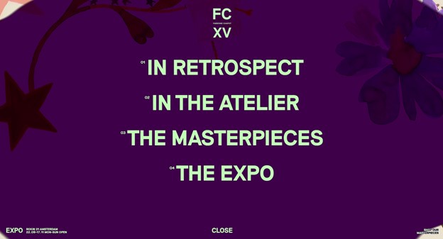
The above menu opens in a full screen overlay, uses large fonts, bright colors, and a great background image that enhances the brand.
Footer Navigation
Navigation should be part of your footer as well. Think about it: When users scroll down to your footer, they have probably looked for a specific piece of information they expected to find on that page but did not. The footer nav serves as your backup plan to help them find info they missed on the page and resides elsewhere on your site.
Popular pages or helpful links in the footer give your website one last chance to help users find what they seek before they give up and leave.
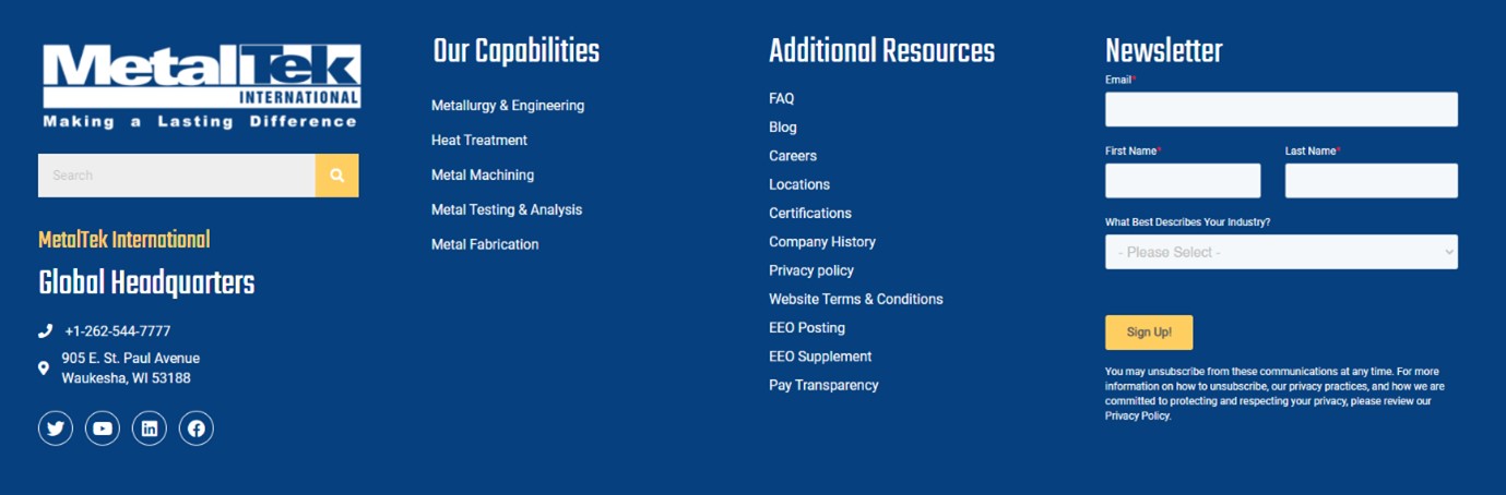
In the example above, users can view MetalTek’s capabilities as well as a list of popular resources within the footer.
Note that navigation is more than a list of links that funnel users to specific content. It also encompasses what they do after they find that nugget. Calls to action or links to related content help your users seamlessly move through the website without continuously relying on main navigation for the next step.
Using Micro-Interactions to Enhance UX
Movement is among the biggest advantages of digital over print. Movement is typically part of micro-interactions, which are built in to practically every website. Micro-interactions are simply moments in which the design reacts to user action. Common examples:
- A site indicates the strength of a password as the user creates it.
- A progress bar shows the advance of a document upload.
- The swipe effect on mobile apps.
- Toggle switches used to indicate ON and OFF states.
- Animations prompted by hovering over buttons.
- A search icon expanding into an input field.
Micro interactions engage users by adding fun and surprise. They help users feel more confident in the brand, company, or product. They have been so successful in delighting and engaging users that they have become more advanced and ubiquitous.
Micro-interactions can improve UX by:
- Letting users know which elements are interactive and which are not.
- They bring an emotional element to websites, which makes the UX more rewarding.
- They instantly communicate if a user action is correct and accepted by the site or if something has gone wrong.
- They encourage overall engagement and enrich the brand.
- They help users avoid errors, and they make errors easier to correct on the fly.
Micro interactions are great, but don’t let them impede the functionality of the page. Micro interactions should enhance the functionality and make the user feel more connected to the design.
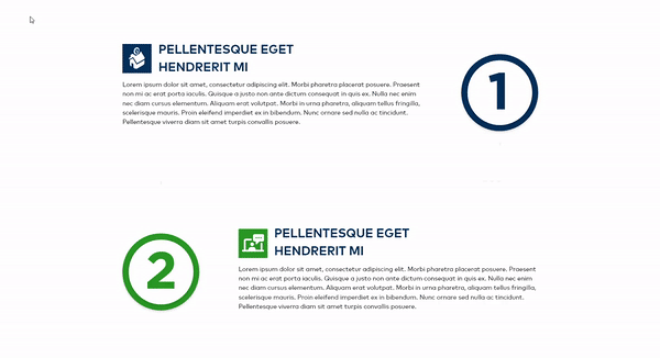
The above example interacts with users as they scroll down the page. A dashed line appears that connects each of the steps in the process.
Web Filters and Usability
Most users filter searches to narrow down to specific products on e-commerce websites. But filters have broader applications on blogs, news sites, manufacturing parts catalogues, client portfolios and more.
Filtering options typically sit on the left-hand side of the screen in a vertical column. Recently, some web designers have opted for a more horizontal approach to filtering. This approach sometimes improves UX. It can prevent users from confusing sorting options (typically displayed above product listings) with filtering options. See this study by Baymard Institute, which also finds that people tend to ignore vertical filters even as they actively search for filtering options. A horizontal filter bar stands out more than a vertical filter, as it aligns with the way users naturally navigate websites.
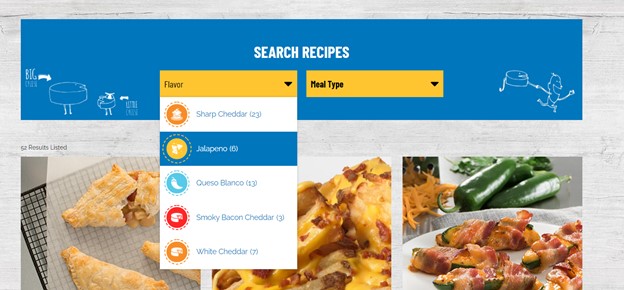
As shown above, Gehl Foods uses a simple horizontal filter to help users sort through recipes.
Another benefit: A horizontal filter allows more room for results to display, because it eliminates the need for a vertical column. This means that products can be shown larger or more products can be displayed in each row.
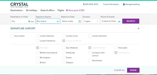
Above: A robust horizontal filter bar on the Crystal Ski Holidays websites.
But a horizontal filter is not always the answer. A traditional vertical filter provides better UX when, for example, there are many filtering options or if the site owner expects filtering options to grow over significantly over time. A vertical filter has more space to accommodate the content, because it is not limited to the width of the device, as a horizontal filter is.
Vertical filtering also relies less on dropdown menus. This can be an advantage on mobile because users aren’t constantly opening and closing dropdowns; the entire options list appears in a single view.
Whether you choose vertical or horizontal filtering, the user should quickly understand how to select multiple filtering values.
Make Your Design More Accessible
Good accessible design serves not only its target audience, but it also improves the experience for all users. For example, larger fonts are easier for everyone to read – not just people with visual impairments. That’s why larger fonts have trended up for a long time and are likely to stick around.
The same with color contrast. Black text on a dark brown background looks bad and makes the content nearly impossible for any user to read. Smart use of color doesn’t just make your website trendy; it improves UX.
Information hierarchy, another design consideration connected to accessibility, likewise benefits all users. The concept goes beyond the site map or pages listed within the navigation and arranging headings in logical correct order. Information hierarchy governs the groupings and structure of content on the page. Grouping like content in blocks, with white space between content blocks, visually defines sections, helps the user understand what content goes together, and makes scanning easier.
By the way, “white space” need not be literally white. Any color can separate content groups.
To learn more about accessibility, read our blog on Website Accessibility and You.
Summary
Good UX isn’t one and done. It’s an ongoing process. It evolves, with research leading to adaptations in design and layout to meet the evolving needs of users. These adaptations show users that you care about them. They build trust in your brand. They create loyal users.
Learn more about Northwoods website design services.