


Updated: January 22, 2024; May 16, 2022
Originally Published: January 8, 2020
Today’s digital marketers must absorb tidal waves of data. How to make sense of it all? Data visualization. But where does a marketer begin? Here’s how to get started with data visualization for your digital marketing.
Why Data Visualization in Marketing?
Marketing is part art and part science, but data always backs the most effective marketing strategies.
Digital marketing tools as Google Ads, Google Analytics, Facebook Insights, Facebook Ads, LinkedIn, and marketing automation tools yield a wealth of data that can inform your strategy. That data can answer simple questions – What social channel do my customers use most? – and complex questions – Can I increase sales while reducing my ad budget? (The answers, as usual: It depends – on the data.)
See Patterns and Trends
Digital marketing and analytics identify patterns and trends of user interaction with our digital properties. Analytics reveal how users consume our website content and marketing campaigns at a large scale. Marketers base decisions on those patterns and trends. Data visualization makes those patterns and trends clear and comprehensible.
Consider, for example, PPC traffic and sales. Say your sales from paid search have decreased over the last three months, but traffic from paid search has increased. Naturally, you want to know why.
A visualization of the trends for traffic and sales can help you start to uncover why, so you can adjust your strategy and tactics based on data, not on a hunch.
Distill Your Data
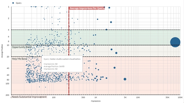
Data sets in marketing, such as those involving keywords, can reach into the millions, depending on the size of your website. Good visualization can distill your data into a graph you can grasp almost at a glance, as opposed to a massive spreadsheet you’d pore over for hours.
Let’s take keyword data as an example. Say your goal is to decrease your PPC spending. You could begin by comparing PPC traffic from certain keywords to your organic search rankings for those keywords.
If you look on a spreadsheet at all the keywords you rank for organically and see how much PPC budget you have spent on those keywords, you would find it hard to distill the data and discover opportunities to improve your strategy.
A graph showing the same data helps you see the keywords that offer opportunity for minimizing PPC spend and shifting focus for those keywords to organic search strategy.

Emphasize Points to Your Stakeholders
We all need to justify our marketing budgets, typically to non-marketers. Show your stakeholders the data to help them understand your work – and to show them your success.
Your boss probably lacks the time and inclination to study a bunch of spreadsheets and data points. So offer a simple dashboard with minimal data points. Green arrows trending up always impress more than numbers on a spreadsheet.
Guide Your Strategy
Gut instinct should never guide marketing strategy. When data guides your strategy, you make the most out of your marketing budget. Visualizing trends and distilling data into useful graphs lead to better-informed and more effective marketing strategy.
How to Get Started with Data Visualization
Start with Google Looker Studio (GLS), the easiest data visualization tool for the uninitiated. This tool, along with connectors from third-party websites, enables you to pull in data from all of your tools, including Google Ads, Google Search Console, Facebook, Instagram, YouTube, and more.
Awesome! But what data points do you need see? Before you jump into GLS, spend some time thinking about exactly what you want to measure, visualize and analyze.
Data Visualization Strategy
Good data visualization strategy stands rooted in goals you’ve set for your overall digital marketing strategy. What are you trying to achieve with your campaigns? More search traffic? More time-on-page for your content? More online sales? These goals will govern your choices of what to include in your data visualization reports.
Okay, you’ve set your goals. Now, what key performance indicators show progress toward those goals? Let’s look at an example for SEO.
Say your goal is to increase online sales from Google organic traffic. That goal points toward measuring the following KPIs:
- Sales from organic traffic
- Sessions from organic traffic
- Keyword rankings for target products
- Search volume for keywords
Even in this simple example, KPIs should go beyond the immediate goal. For SEO, all of these metrics are tied together. Without high keyword rankings, you are less likely to gain organic sessions. And if you do not gain organic sessions, you won’t achieve your goal of more sales from organic search.
Important: Put this data visualization strategy together when you first develop your digital marketing strategy, so you’ll be ready to measure results as soon as you implement your marketing tactics.
Building a Dashboard
Let’s return to our SEO example, in which we look at sales from organic search and at sessions from organic search. The following dashboard looks at organic revenue, traffic and keyword rankings over time:
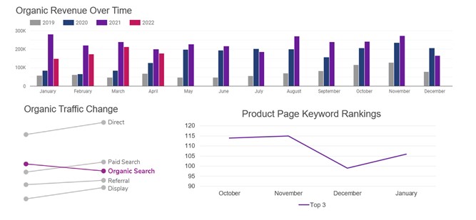
This distilled data visualization shows that revenue from organic search increased from February to March, but it was down year-over-year. We are also able to see that organic traffic and keywords have seen decreases year-over-year.
This dashboard helps us see where we need to focus our efforts: improving organic keyword rankings for the product pages in an effort to drive more traffic and revenue from organic search.
Once we see this in the dashboard, we can change our marketing focus for the next few months.
By putting together simple data visualization dashboards that are tied to our goals, we can easily determine what succeeded and where we need to refine our strategy.
If you need assistance with data visualization, analysis or dashboard creation, don't hesitate to reach out to schedule a consultation. We're happy to help!