


A modern, highly functional website design represents its brand’s professionalism and creates a good first impression. But what, exactly, constitutes a modern, attractive website in 2022?
Let’s consider 10 design trends that are trending right now.
1. Layering Elements
Layering elements can bring pleasing, unique shapes to a website’s design. They engage the eye and hold the user’s attention longer, provided your imagery and illustrations pair well.
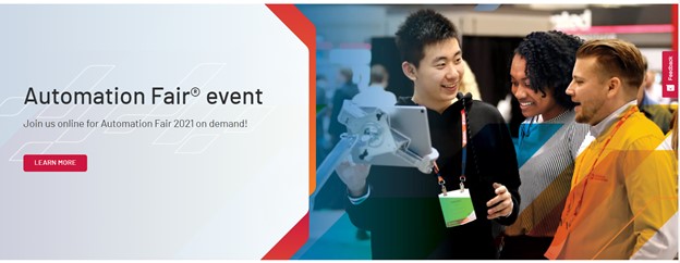
In the example below, the designer set off layered rectangular images with teal polka dots and a graphic of a robotic arm. Those graphic elements add colors that complement those in the photos. They create the illusion of depth and generally elevate the design. The design goes just far enough; if it were much more complex or busy, it risks becoming too distracting.
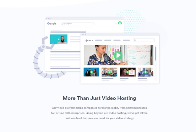
This example is from Vidyard.
Layering doesn’t need to be complex. A couple of simple embellishments to an image can make an otherwise boring content box a lot more interesting:
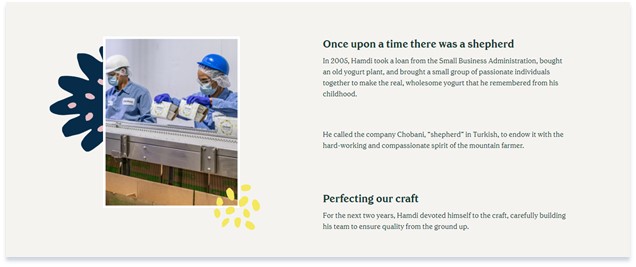
The example above is from the Chobani website.
Without the graphic embellishments, the photos wouldn’t stand out at all. The decorative graphics at the left and lower right come from an array of visual elements introduced during Chobani’s 2017 design overhaul. They appear on some packaging and throughout Chobani’s website.
The embellishments add character, hold interest, and tie the image more closely to the brand.
2. Customized Graphics
Authentic, home-grown, yet professional imagery beats stock photography, which can sometimes feel inauthentic. But not every business can enjoy the luxury of exclusive photography. If you must rely on stock photos, add custom elements to make them your own.
Layering is one way, as are changing colors within the image, or changing the shape of the entire image. Customizing graphics can also integrate stock photos into your overall design.
The example above is from Rockwell Automation. The Rockwell design team added multiple color overlays and angles. The revised color palette integrates better with the Rockwell brand. The team applied these design elements across the whole site:
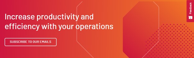
The call-to-action content (“Subscribe to our emails”) relies on text rather than imagery but note the colors and shapes around the call to action. They closely relate to the stock photo treatment in the previous example. Unity makes for a cohesive overall website design.
Shape is another easy way to customize graphics. In the example below, the image of the woman appears within a distinctive shape. That graphic touch makes the image a lot more exciting than the usual boring rectangle. The actual content of the photo looks like stock photography, but a casual change of shape makes it feel native to the design and the brand.
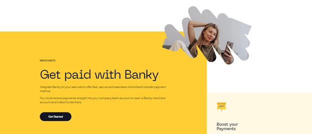
The example above is from Banky.
Vector artwork also makes it easy to customize your own graphics. You can style or change the colors of vector artwork to match your brand. You can create vector artwork from scratch, but it is far faster and easier to purchase it from a stock photography website and amend for your brand and design.
In the example below, Northwoods designers updated the colors and added a plaid pattern to a dress. The changes add visual interest and tie in with our Titan CMS brand.
This example is from Titan CMS.
3. Interactions
Digital images can move. Print images can’t. Users can interact with animations, and the most common animated interaction is a progress bar. But animations can be more fun than that. They can be entirely practical even as they make your website feel trendy and memorable. An animation can, for example, visually demonstrate the strength of a password as a user creates it:
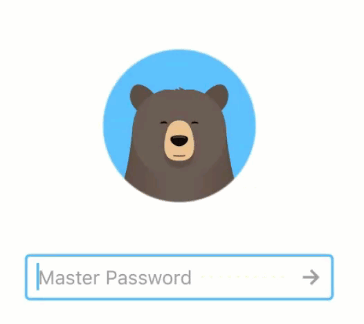
RememBear adds charm to an application that helps users manage passwords. The bear follows along as the user enters the password. Correct passwords turn the colors from blue to olive green, and the bear’s background turns green. The bear nods in approval. This visual feedback creates a memorable experience that surprises and delights users.
4. Handwritten Elements
Handwritten fonts add personal touches to web design. They can help a brand feel more casual and approachable. They stand out from typical, more structured font styles, so they can direct attention to a specific piece of visual content. But choose carefully because some cursive fonts are hard to read.
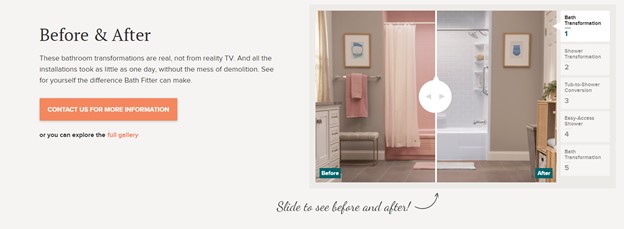
The example above is from Bath Fitter. The handwritten font style draws attention to their before-and-after slider.
Line art, like cursive fonts, can work with other design elements and create an artisanal vibe. Note the line art within the Search Recipes filter area in the image below. The non-uniform lines mimic the variable ink paths of a human hand pressing the flexible nib of a pen onto paper. That subtlety might have only subliminal impact, but the drawings themselves are obvious fun.
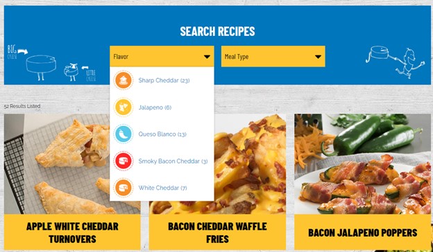
The example above is from Gehl Food & Beverage.
You can also insert line art directly into photos, as in the next example. The subliminal message: Fill in the lines – picture yourself here! Imagine the life and work that could happen in this grand warehouse – if it’s all protected by the right roof and expert roofers.

The example above is from North American Roofing.
You don’t need to be Picasso to create stunning hand drawn images for your website. Below, a few simple lines transform an okay mug shot into something playful and unique.
The example above is from Buffer.
5. Split Screen Design
Designers create split-screen layouts by adjusting two full-screen, landscape images into two or more adjacent vertical portrait blocks that share the same screen. The split screen combination doesn’t necessarily need to cover the entire width of the page.
With a split-screen layout, designers can give equal weight to two important elements at the same time; this configuration invites users to choose one. In the example below, the split screen guides the user to identify as either looking for a job or looking to hire. The user chooses, and the link takes the user to the appropriate areas of the website.
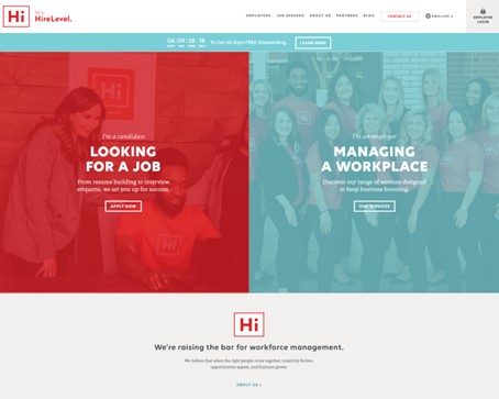
The example above is from HireLevel.
Split screen design doesn’t always present users with two choices. It often works in conjunction with a strong image or visual element. The image typically reinforces the written copy’s message. Separating text and image encourages users to digest each individually.
In the example below, the user can read the text on the right-hand side to understand what the company does; or the user can watch the video that plays on the left, without the distraction of overlaid text.
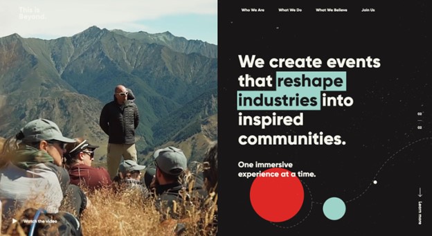
This example is from This is Beyond.
Asymmetrical splits can direct users’ focus.
The photo (above) is wider than the area of written content and is likely to draw user attention first. Is your brand about personality? Do you have great imagery? In general, does the imagery speak more eloquently than your words? Then imagery might take up most of the site real estate, with text as very brief explanation and commentary.
Still, that blue block contrasts sharply with the image and won’t be overlooked. The text is narrow within the color block. That’s good. Wide, gangling, dangling text is always bad and harder to read.
6. Large Footers
Footers are underrated. Large footers are coming back, and that’s a good thing!
Users scroll all the way down to the footer of a website because they expected to find something specific on the page, but it wasn’t there. The footer is the backup plan to help them find information they missed as they scrolled or that lives somewhere else on the website.
The large footer below helps users by showing popular links to other areas of the website and helps users who might have missed important content.
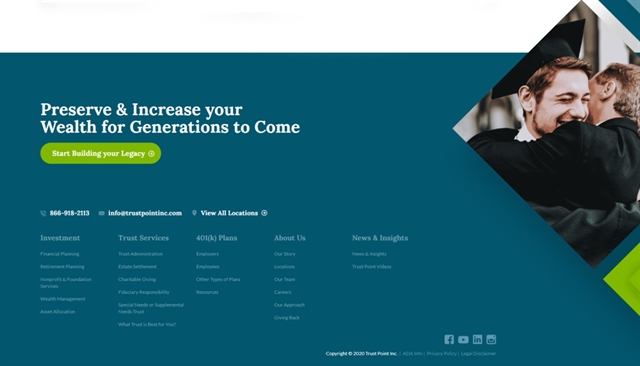
The example above is from TrustPoint.
The footer below offers more than just helpful links: A newsletter sign-up, social media links, contact information and, most important, a search bar. A search bar in the footer can be golden for users who’ve made it all the way to the bottom of the page. If they haven’t found what they were looking for on that page, they can search for it in the footer.
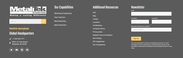
The example above is from MetalTek.
7. Oversized Text
Many designers are shifting away from photographs or illustrations in the hero sections of their website, most notable on home pages. Although hero images have big, immediate visual impact, all-text heroes focus more on site content. They also lend a very clean look, with exaggerated white space.
Such text must be interesting in both meaning and appearance. And very large. Choose a striking typeface. Add a pattern/texture, use strong gradients, or add an image to the background of the font face itself, as in this example:
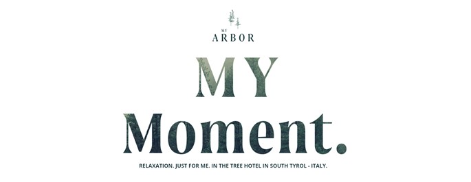
The example above is from My Arbor.
Text-as-hero translates readily to mobile.
Bold color fields also work in hero sections. They can be interesting without representational imagery. In this example the text is large, in two colors, and works against a strong background color.
This is a good solution if you lack great imagery. (Getting good imagery is no small matter. A hero image must be of high quality. We typically recommended around 2000px wide.) Don’t force mediocre imagery into your design. It will ruin it. A website can feel modern without photos:
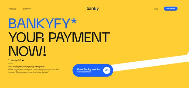
The example above is from Banky.
8. Color Minimalism
You might choose muted colors or colors that are bold and saturated to make your brand stand out. The color must support the star, which is the text. The very simple color palette in the example below packs a strong punch.
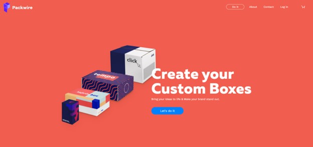
This example is from Packwire.
Colors such as these lend themselves to readability and high contrast. This makes your site accessible to more users. Color contrast is among the simplest and most powerful means to achieve accessibility. It helps your website reach the greatest possible audience with the least frustration.
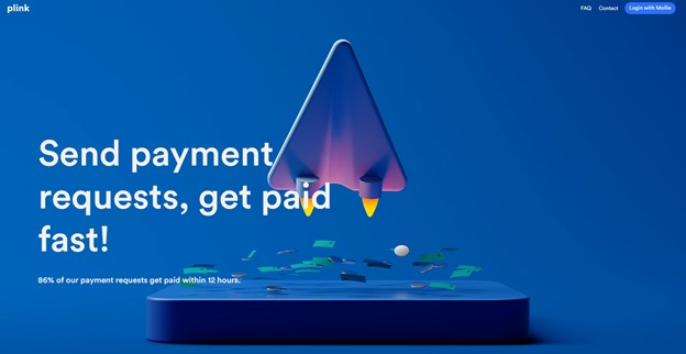
The example above is from plink.
9. Creative Scrolling Experiences
Brand storytelling through animation as the user scrolls has gone from design trend to enduring staple. The practice has a name.
"Scrollytelling" refers to online longform stories, told with audio/video/animation effects triggered by user scrolling. It’s a great way to keep the user engaged in the story. It works especially well for stories that describe a chronology of events or have data visualization elements, such as animated charts and statistics:
The example from is from Adobe CXM.
We’ve all seen much more ambitious and layered examples of interactivity, with complex interplay of text and multi-media elements. Complicated stories can take a team months to program. But simplicity works, too, as above. It engages the reader with bold color and multi-media breaks that don’t require excessive programming time.
10. Inclusive & Accessible Design
Intentional inclusivity and diversity in design is no mere trend; it signals long-term social progress. Fortunately, accessible design has become the norm for marketers choosing brand imagery and messaging. You don’t want to be left behind or leave your audience feeling unrepresented.
We still have a lot of work to do as an industry, as we learn to build web properties that are accessible to everyone. This includes high color contrast, hierarchical order of content and headings, integration with voice-over, and systems that don’t require the user to navigate with a mouse.
We must approach this work intentionally at the outset of our projects, and we need to plan to put every piece in place, including custom graphics, animations, and vector illustrations. The example below includes vector art that depicts multiple races. Our websites should extend a warm welcome to all users.
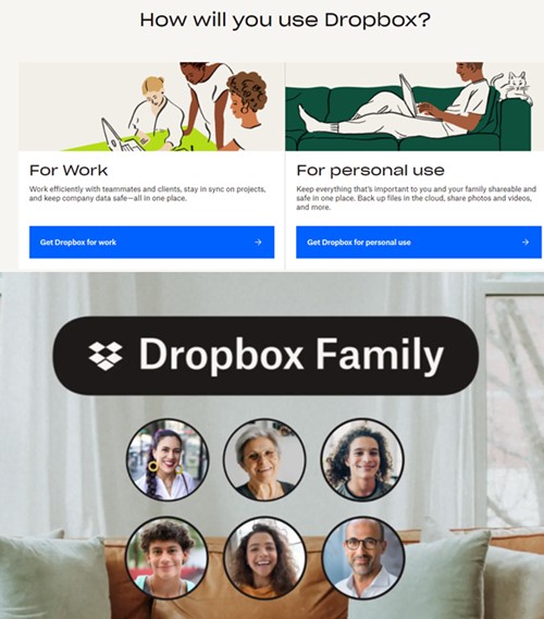
The example above is from Dropbox.
Final Thoughts
There are many modern design trends to consider that can help you showcase your unique brand online. The key is to choose ones that support your overall brand strategy and the experience that you want to give your website visitors. Working with an experienced digital designer can help you choose the right trends and implement them successfully.
If you need assistance with website design, Northwoods can help! Learn more about our website design services and see how we’ve helped other companies achieve their digital goals with exceptional and functional design.